Carina Design System
Growing a design system for better designer-developer collaboration
Cvent is an SaaS platform for event management, marketing, and registration. They'd been making software for event planners, marketers, attendees, and vendors for 20 years, but their UX team was only a few years old. For my 11-week product design internship, I worked on the design system team on 3 different projects.
The Cvent Design System, which was named Carina, was a year in the making. As one of the three designers working solely on Carina, I was responsible for making some early decisions required to scale the design system and start shipping it. I also contributed 3 different components.
Roles
Team
Time
June 2019 - August 2019 (11 weeks)
Tools Used
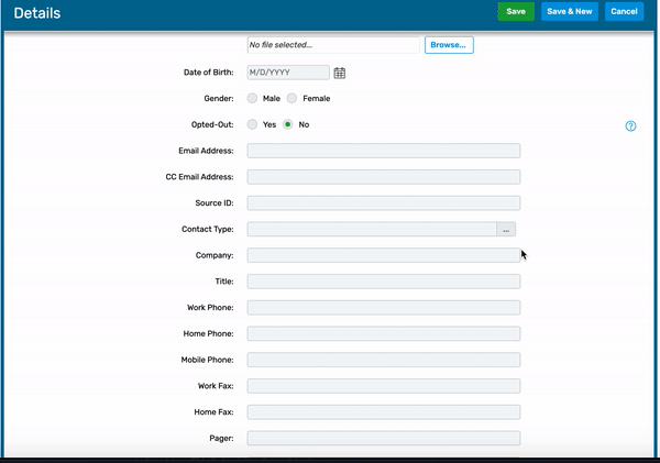
The Ellipses Control was a component that appeared in the legacy Cvent products. It was a form field with an ellipses button attached to it. The button pulled up a modal window that helped users select input for the form field, or create a new value.
Since Cvent's products were made for event planners, often planning large-scale, complex events, the Ellipses Control allowed for use cases where event planners might not know exactly what to input; for example, a vendor's name.
My job was to redesign the Ellipses Control for Carina while following Carina's design principles of being simple, inviting, and fresh.
Carina's design principles are about being fresh, simple, and inviting. A complex table hidden in an ambiguous control did not follow those principles. Instead of a one-size-fits-all solution, I came up with a range of solutions for the variety of use cases I found in the Cvent products, organized by complexity level.
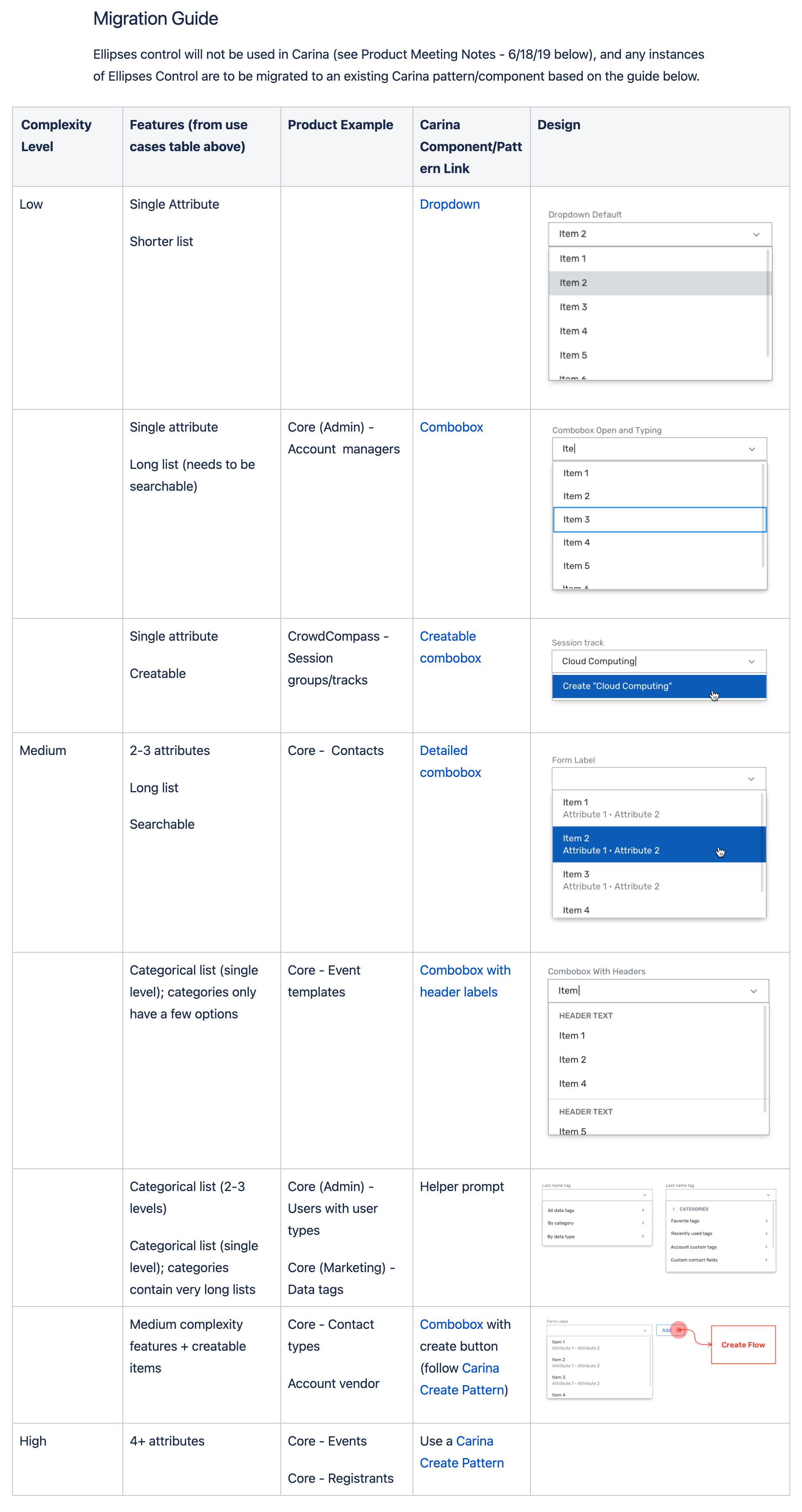
The need for these components came directly from the use cases that were previously (poorly) addressed with the Ellipses Control.

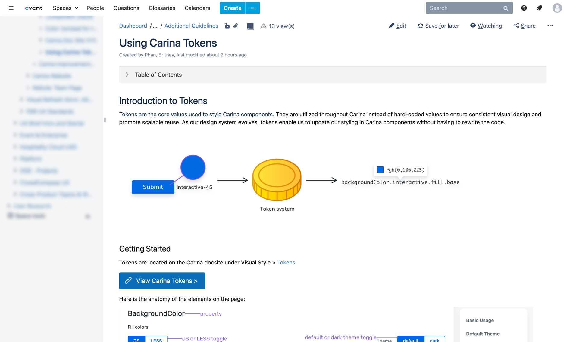
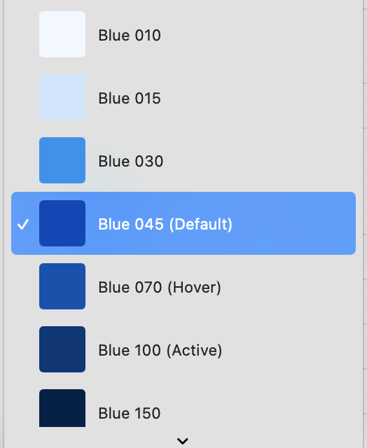
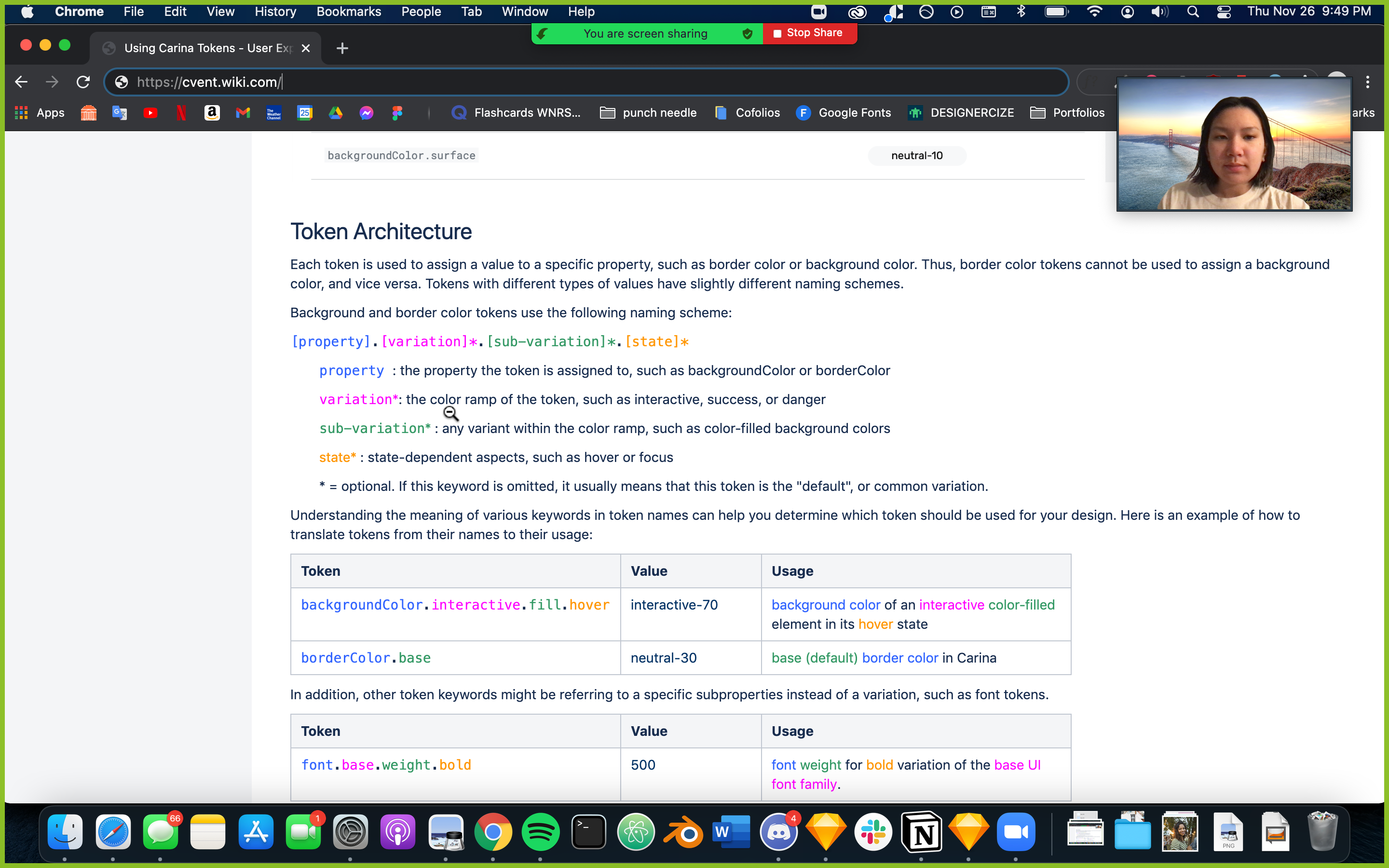
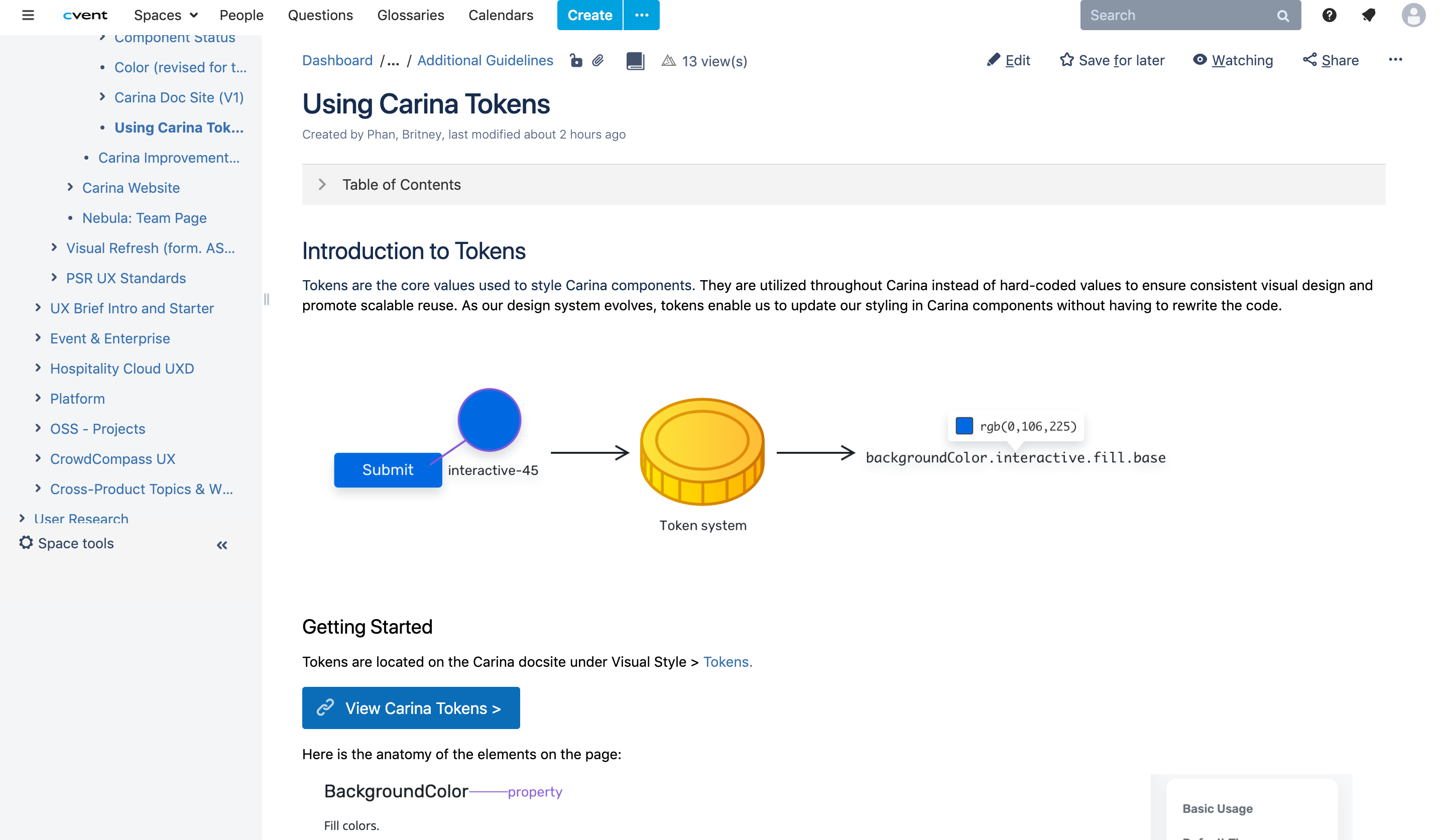
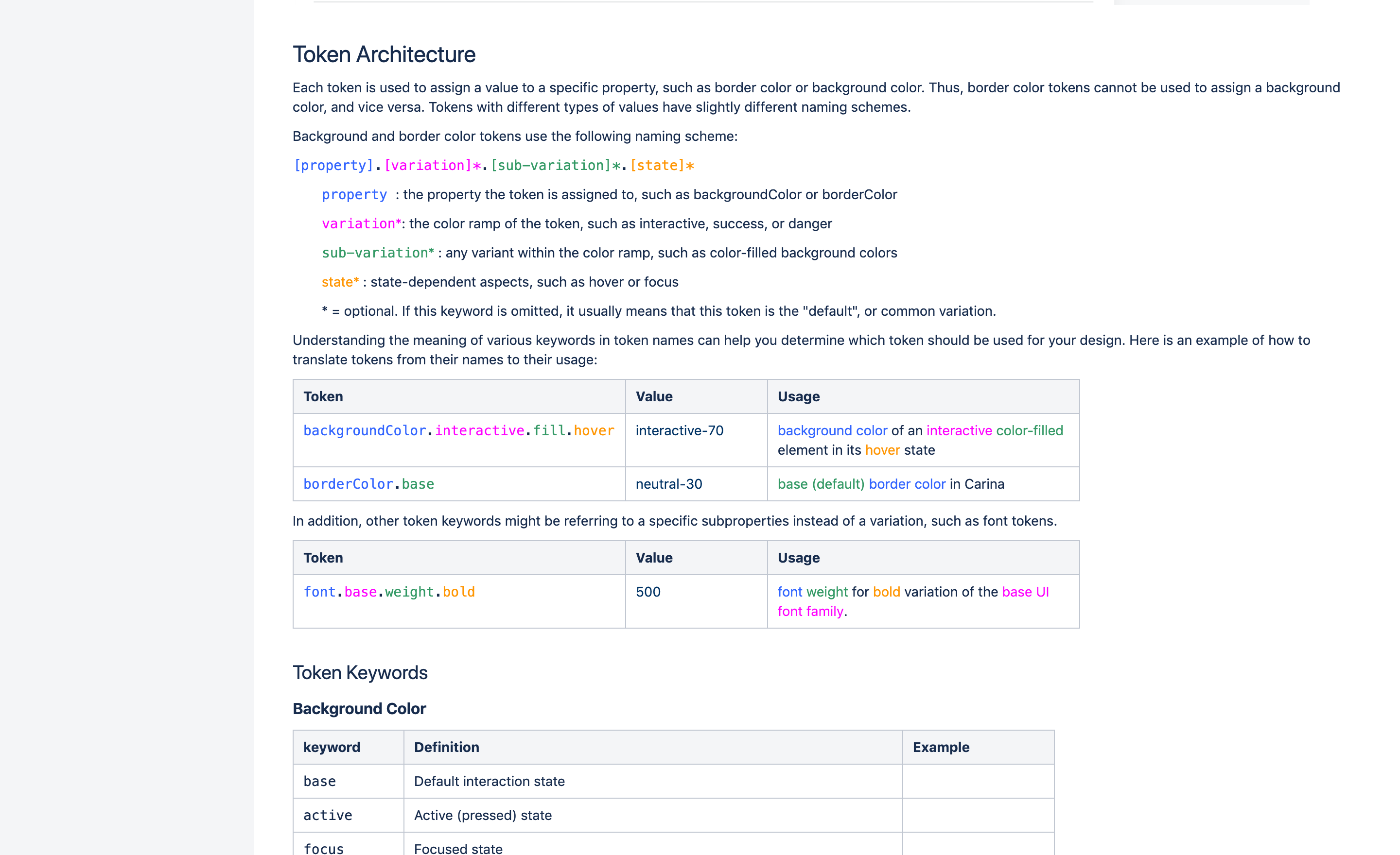
Design Tokens are the building blocks of any design system. They are variables that store color, typography, and sizing values. Instead of using hard-coded values, tokens are used to promote scalability and adaptability as the design system evolves.
To a developer at Cvent, a design token might look like this:
To a designer, they looked more like the image to the right.
Designers were not using tokens, and developers were frustrated that they had to open Sketch files to figure out what colors to use when coding Carina components. On the other hand, designers didn't understand how tokens worked, or why they couldn't just give the RGB color code.
My job was to come up with a solution that would help bridge the gap between designers and developers when it came to using tokens and handing off designs.
A design system is only effective if people are willing to adopt it. Creating a successful design system isn't just designing components and choosing colors. It also involves the documentation, promotion, and education of the design system. This principle guided my solution, which came after many rounds of iterating on different ideas.
As a Carina Design System designer, I was asked to contribute additional components to the design system. I worked directly with developers, an accessibility designer, and the Carina Design Manager. In addition to the design of each component, I was responsible for coming up with different interaction states, accessibility guidelines, and usage guidelines for other designers.
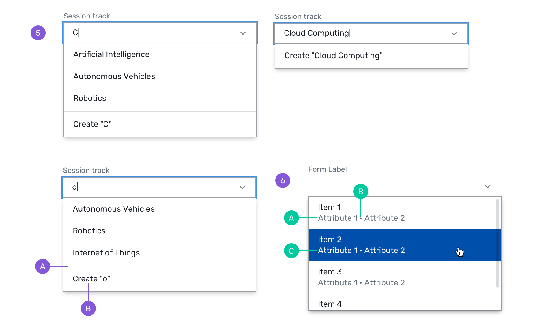
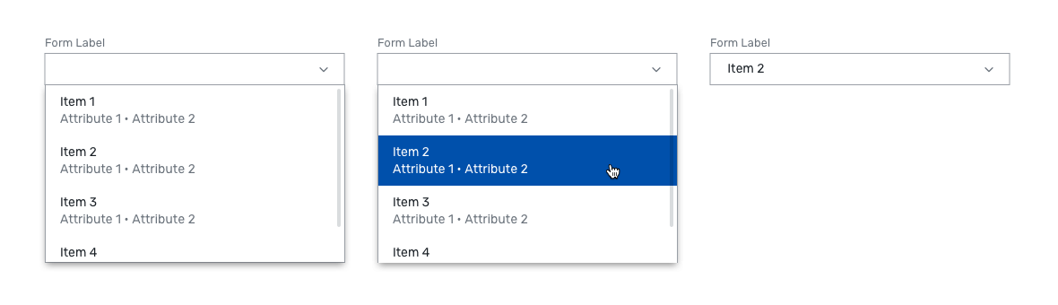
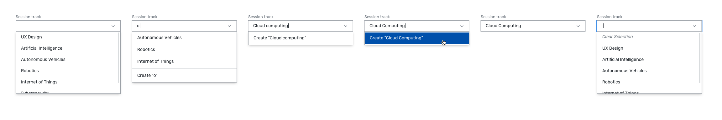
1. Creatable & Detailed Combobox

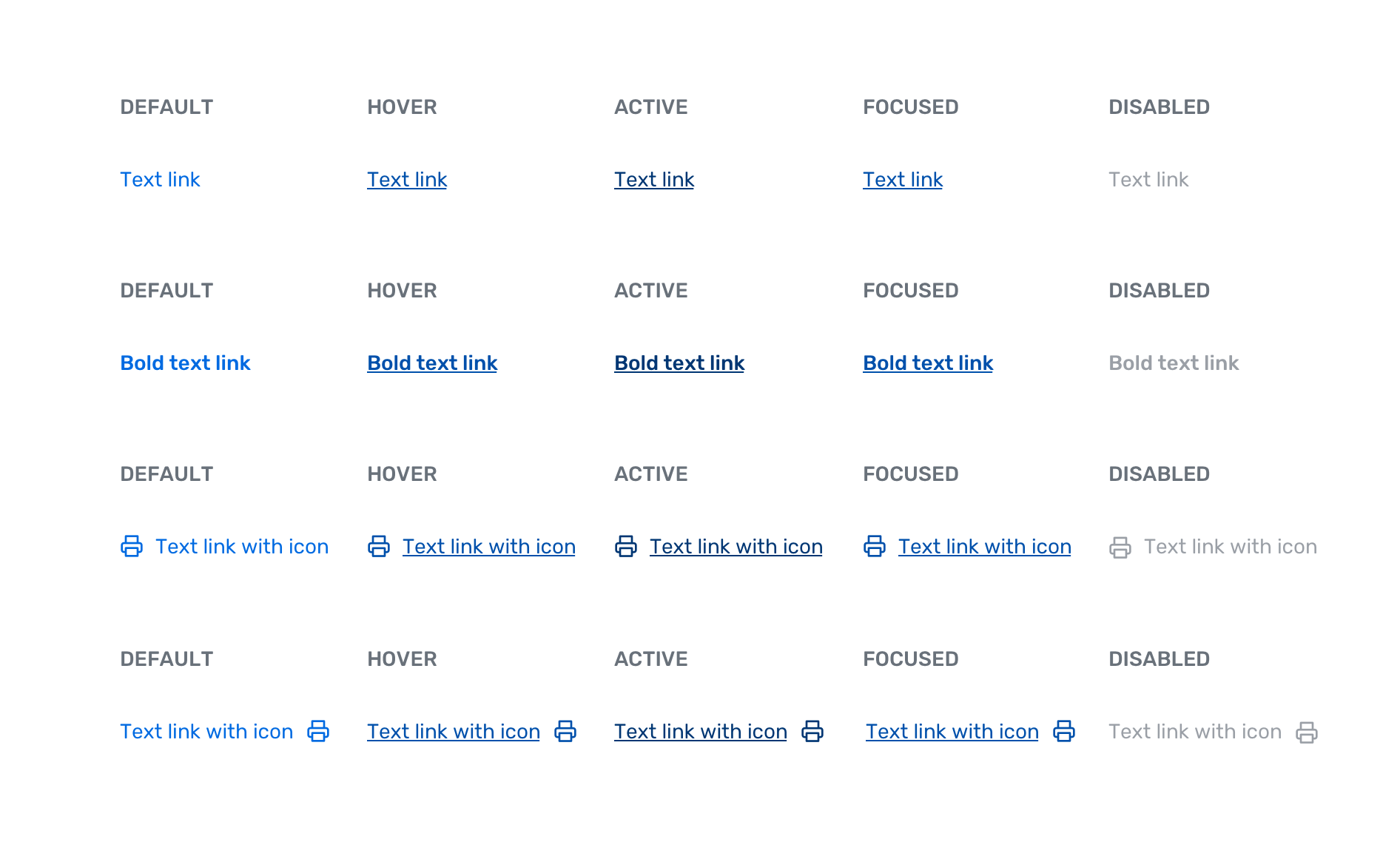
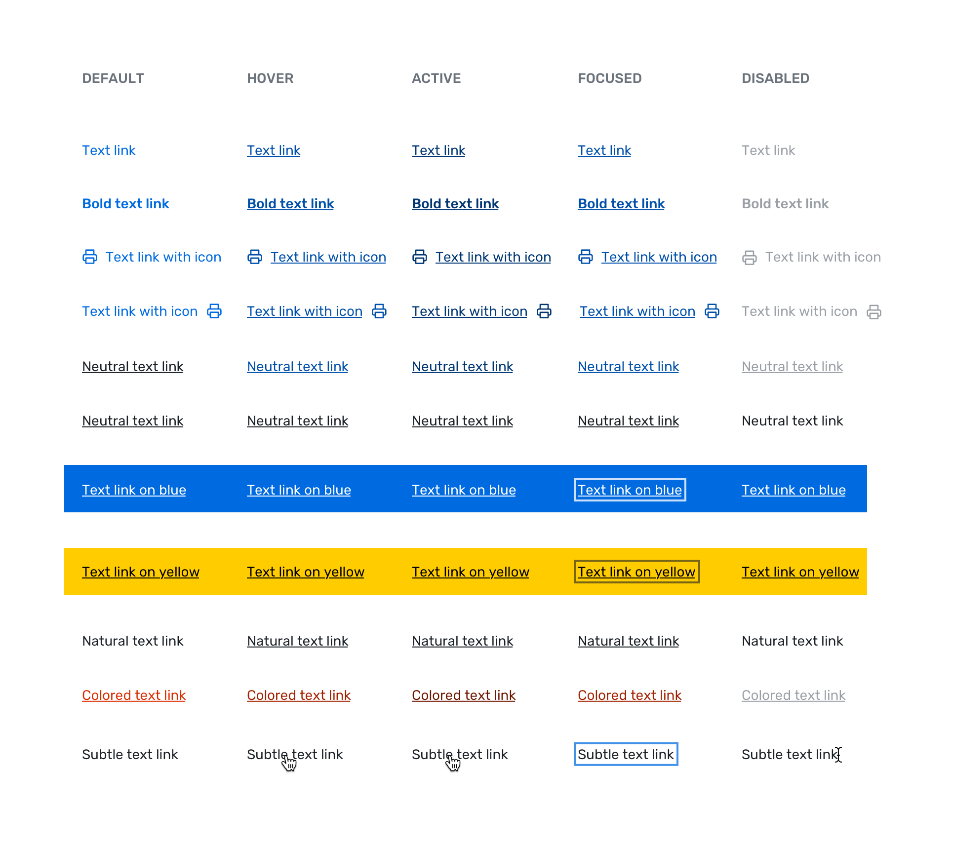
2. Text Link
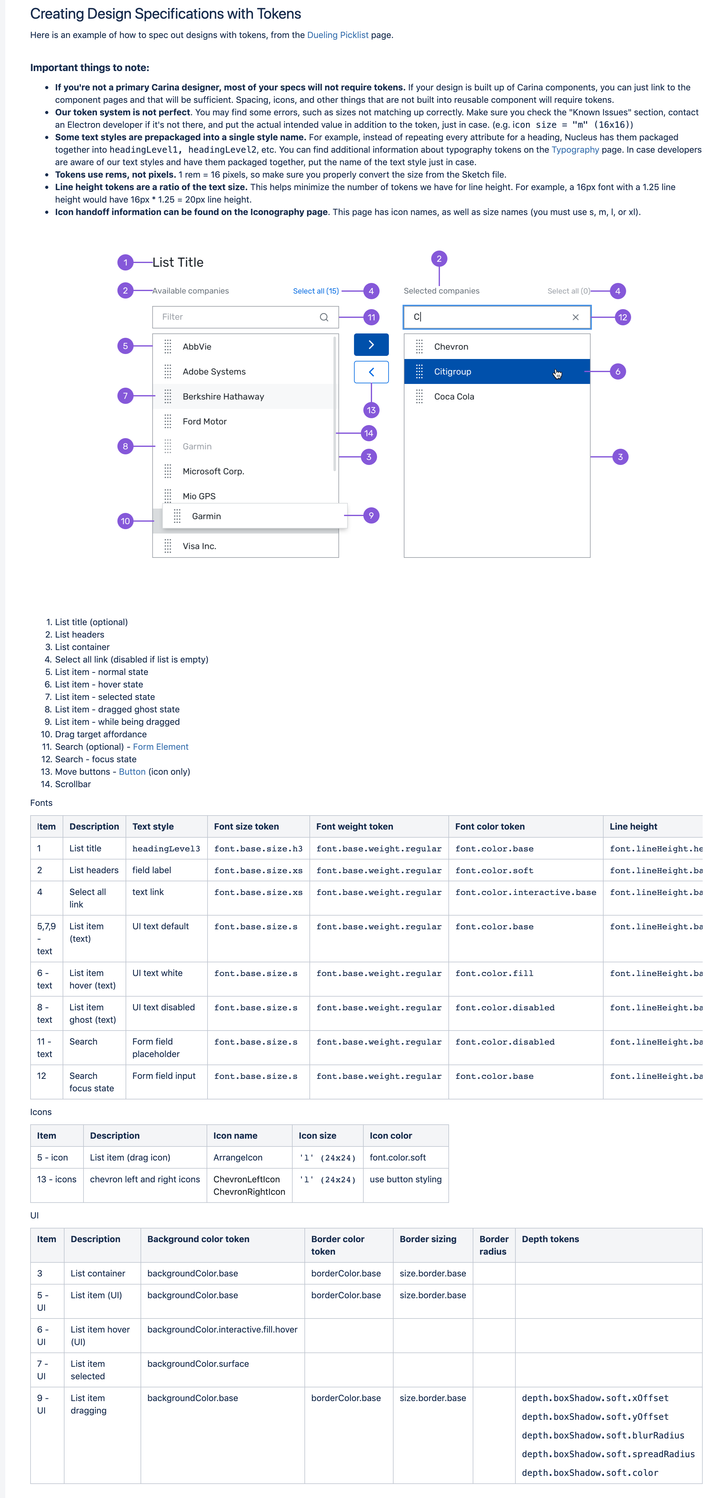
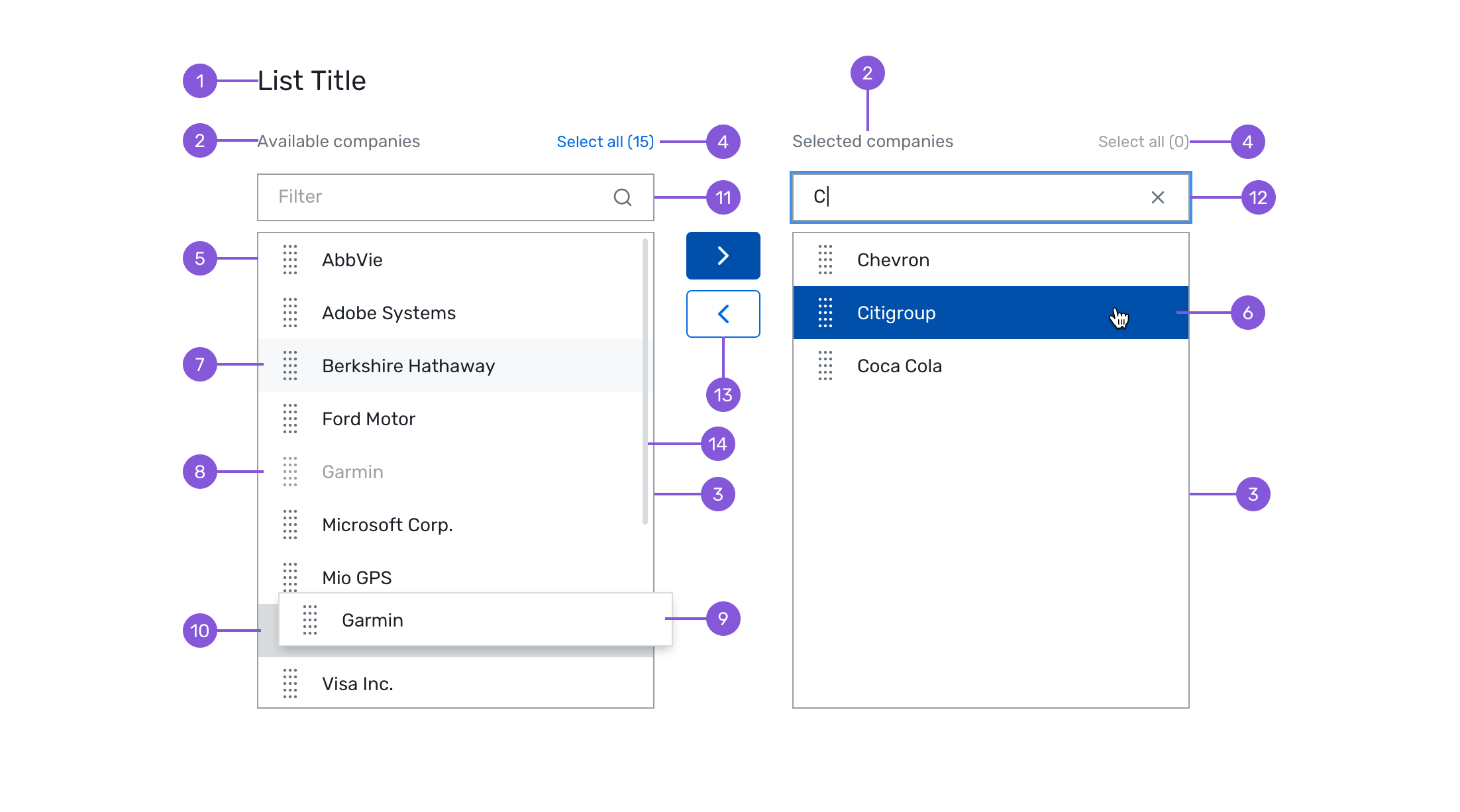
3. Dueling Picklist
During this time, I got familiar with many different tools and workflows: