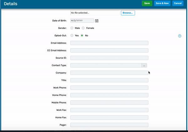
As a designer for the Carina Design System, we were often responsible for determining how legacy product patterns would migrate over to our new design system. Oftentimes, these legacy product patterns were designed 10 years ago, before there was even a UX team at Cvent. The Ellipses Control was a legacy form field component with an ellipses button icon, and it was my job to determine its usage and decide whether it had a place in Carina.

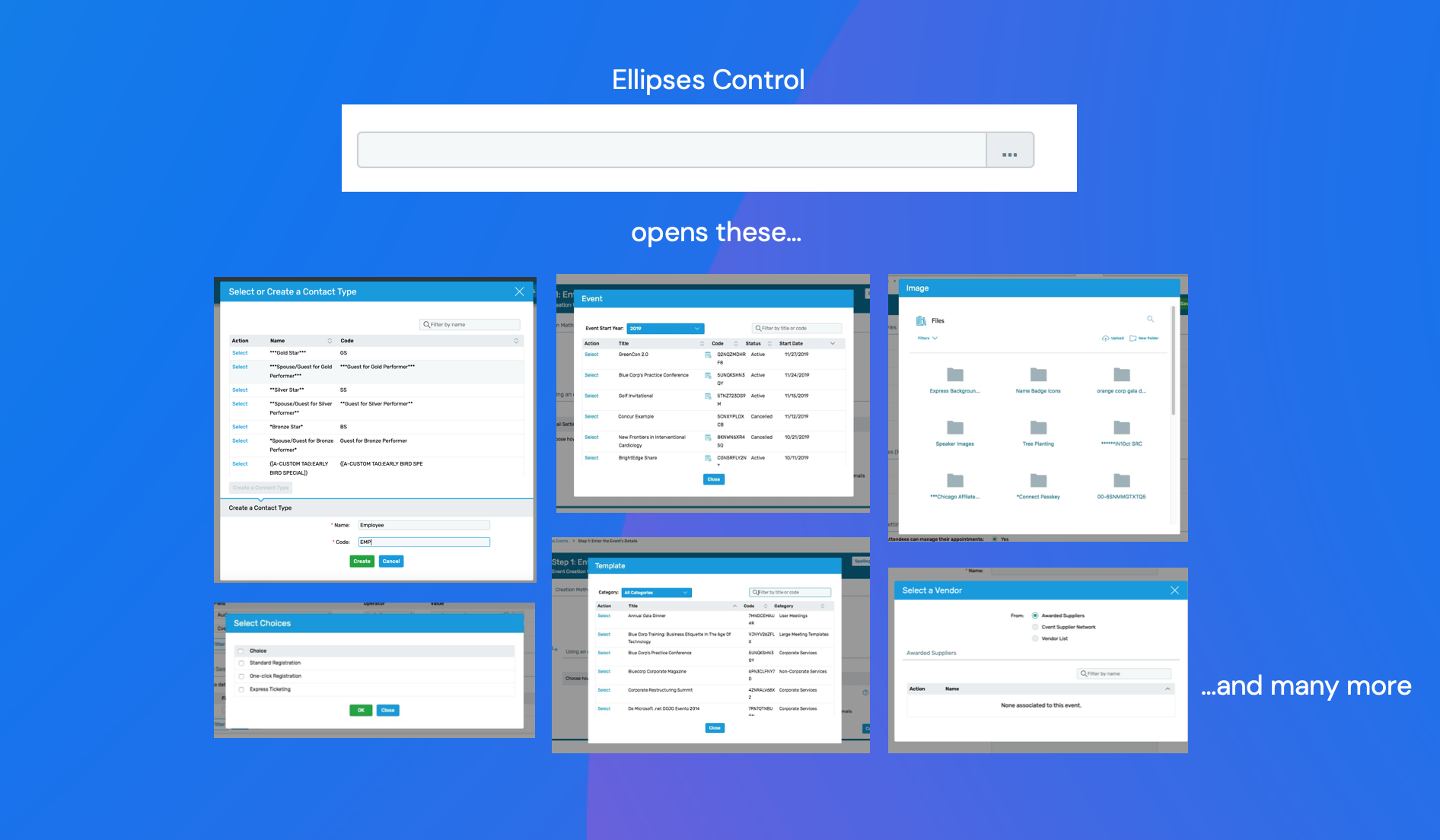
This component was a combination of a combobox, dropdown, table, modal, and text input field. It did a lot of things.
In the larger context of the Cvent product space, the Ellipses Control appeared when users had to fill out certain forms. Here are some example use cases:
How might we design for users selecting data to complete complex enterprise tasks?
My discovery work began with a thorough audit of the Ellipses Control within Cvent products. Since I had just begun my internship, I spent a few days going through the different products, trying to understand the use cases for the Ellipses Control.
I quickly realized that the modal that popped up when clicking an Ellipses Control basically had no limit to what kind of content was inside. There were multi-step create flows, complex data tables, and nested menus.
The one thing that all of these flows had in common, however, was that they were helping the user select pre-defined input for the form field. While I didn't have access to users for the discovery phase of this project, I studied up on the user research that was previously completed for Carina. A component like the Ellipses Control approached a common use case in enterprise software:
Event management has a lot of complex data entry. It's unrealistic to expect users to memorize and perfectly enter every single Event Code or Email Data Tag or other complex data type. They need a component to help them search for and select these pre-defined items, without disrupting their workflow.
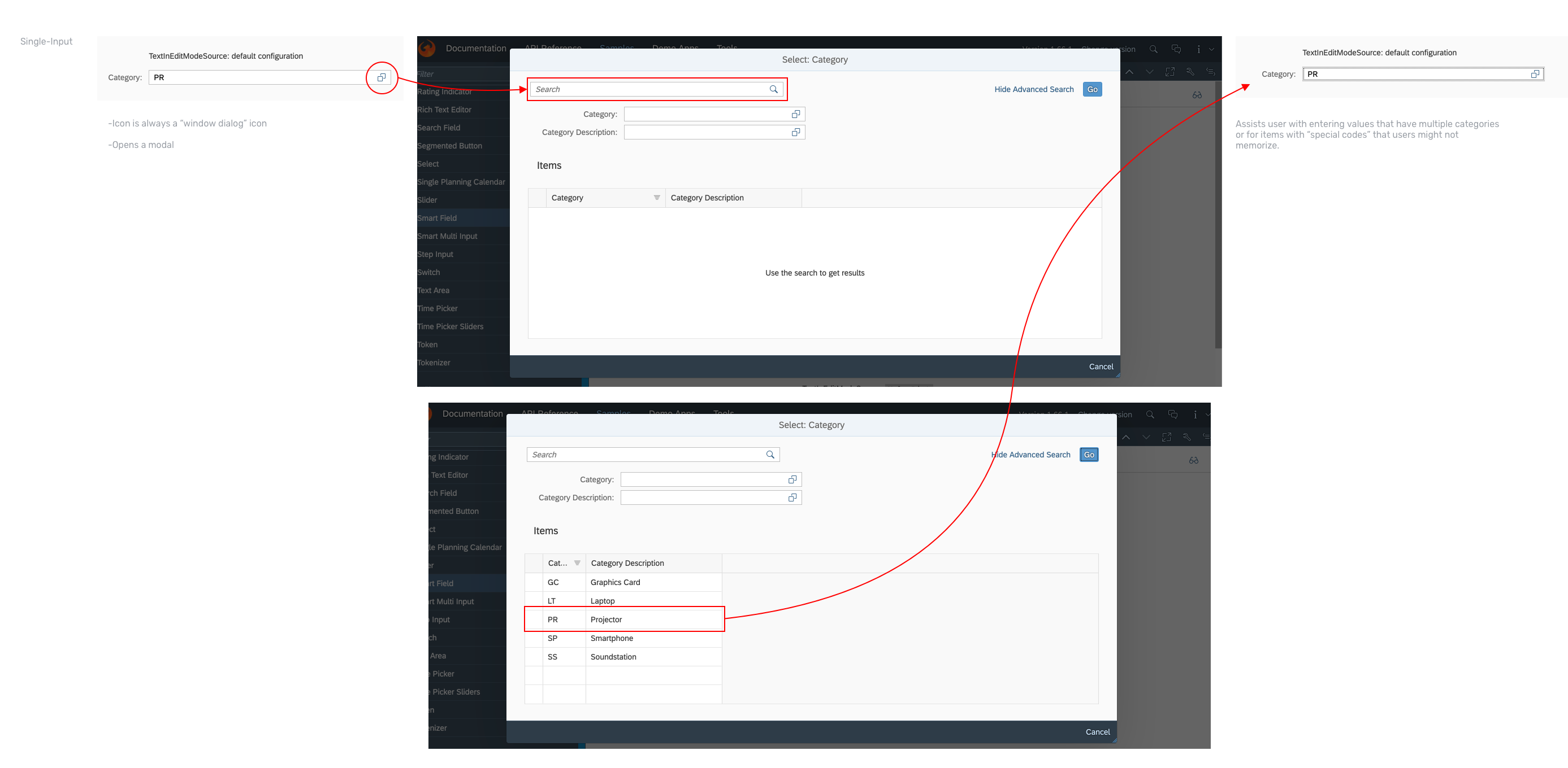
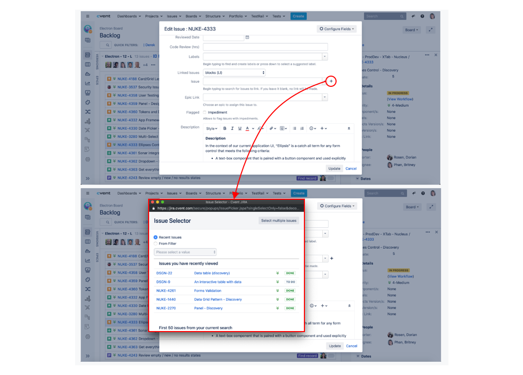
Now that I had an idea of the general use case for the Ellipses Control, I continued my discovery work by looking at how other companies addressed this problem. I searched for complex inputs at other enterprise companies, like SAP, Salesforce, Atlassian, IBM, and Workday.
.gif)
At the culmination of my Discovery work, I worked with the Carina Design Manager to organize a UX Jam. We had 6 other designers — some working on Carina, some working directly on Cvent products — join us for the 2-hour ideation workshop. The purpose of the UX Jam was not necessarily to come up with actual designs, but to come up with ideas, which may come in the form of user stories, design frameworks, user flows. Here was a user story the Carina Design Manager came up with:
As an event marketer, planner, or account admin managing my marketing emails, contacts, events, or account...
Given I have to search for or browse through a predefined list,
When there are one or many options to select from,
Then the Ellipses Control allows me to easily search for the option(s) I need to select, OR allows me to create a new item to select.
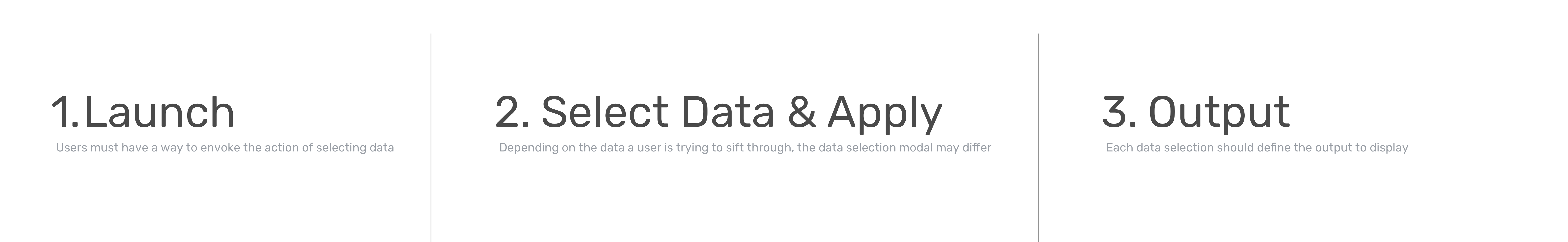
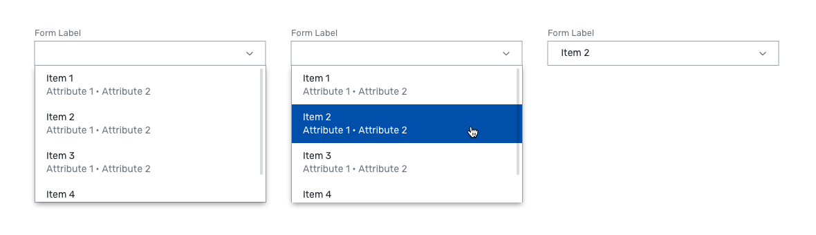
Additionally, another designer came up with a basic user flow for the many patterns we had been seeing. Essentially, the Ellipses Control interaction could be broken down into 3 steps, no matter what the use case was.
After all these ideas were brought up, we came together as a group and made a decision about the future of the Ellipses Control.
The consensus was that we should not move the Ellipses Control forward, and instead create rules around when to use comboboxes, dropdowns, menus, and order components.
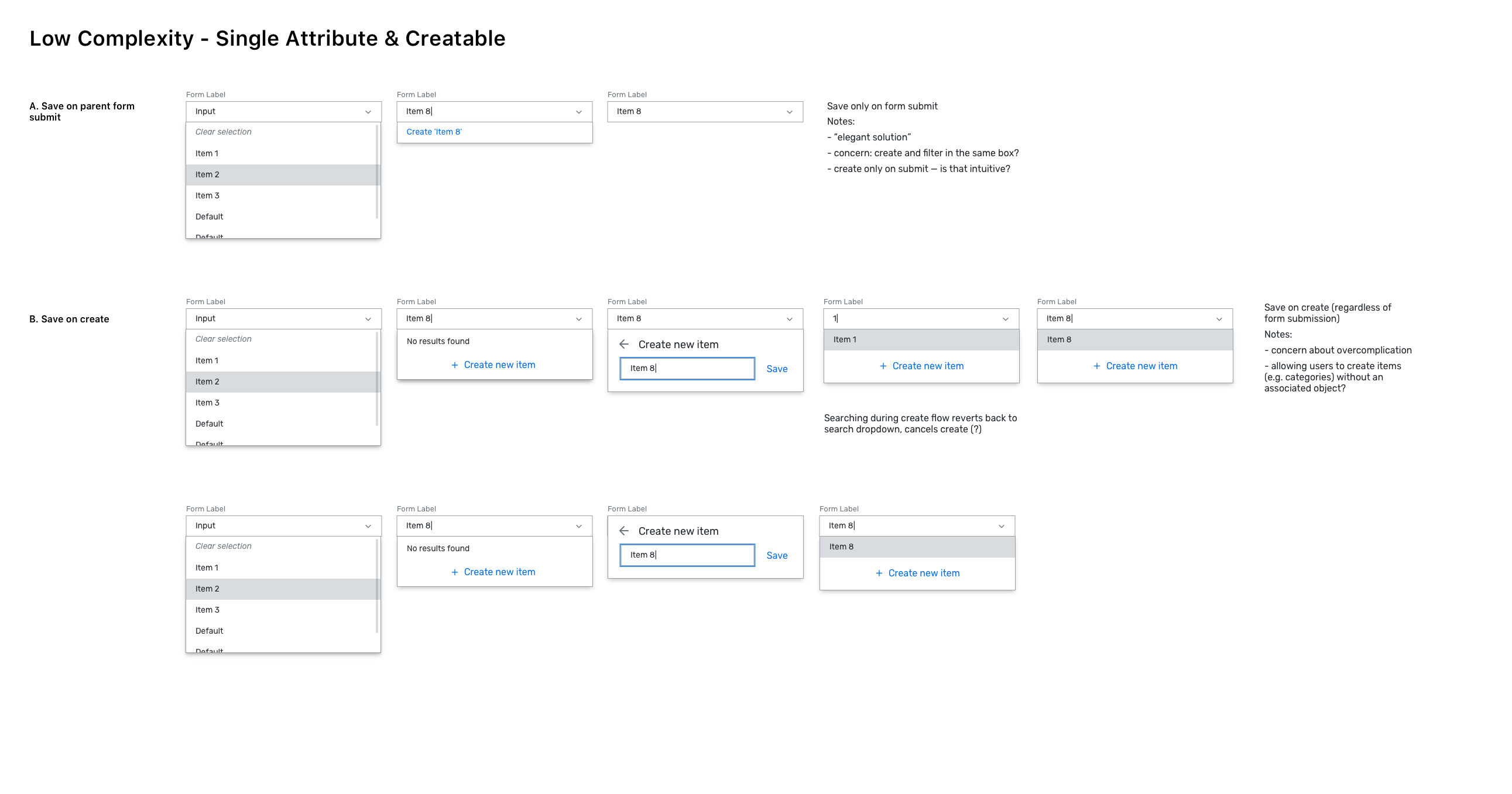
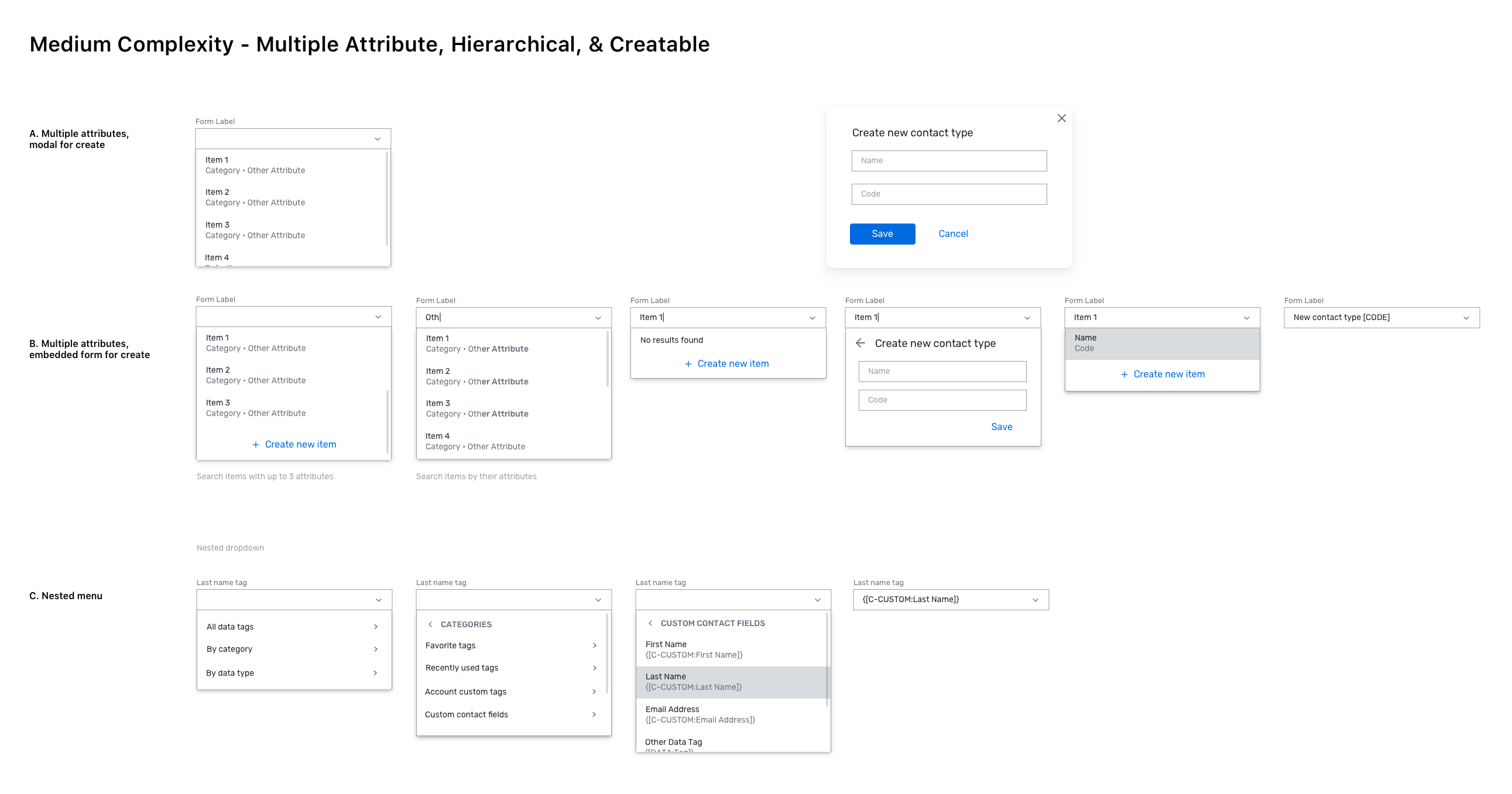
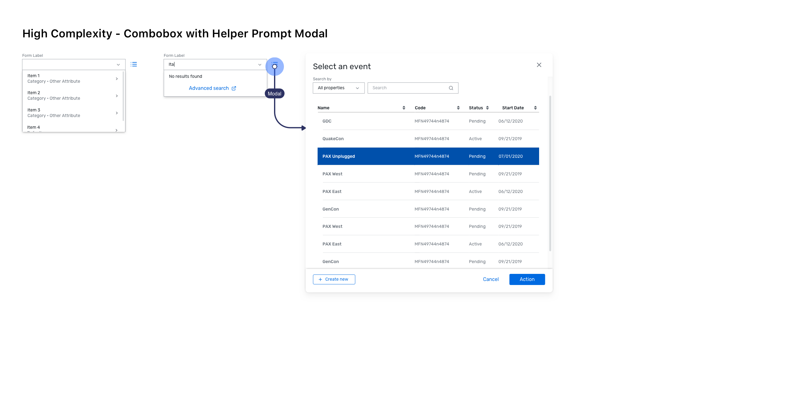
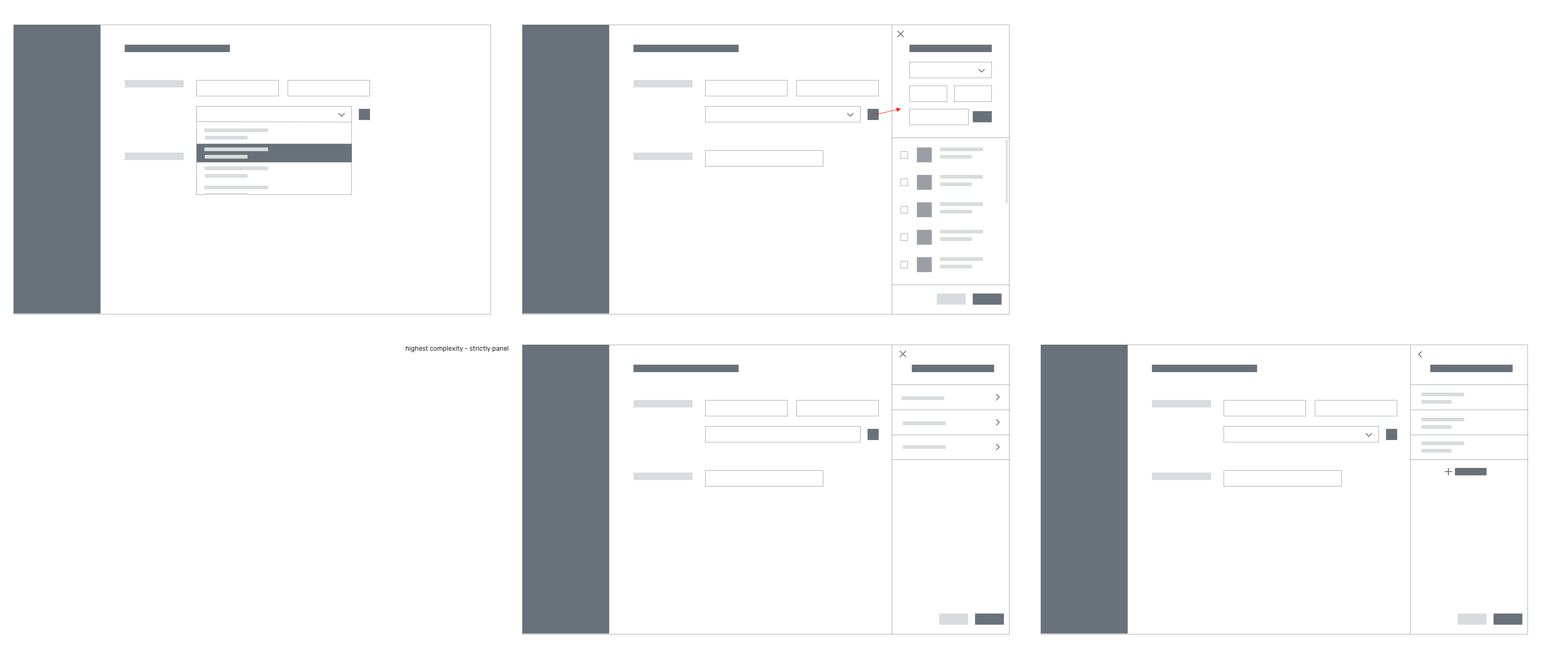
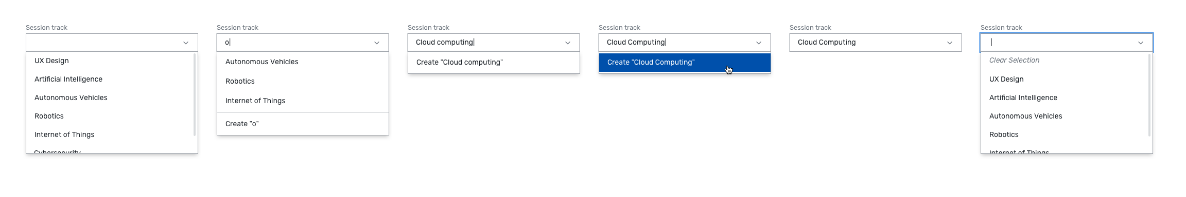
After the UX Jam, I began iterating on my own. I began by laying out the use cases and coming up with solutions to replace each one. Soon, I realized that the use cases could be grouped into different complexity levels. Some Ellipses Controls were used to enter a single text input. Some were used to select from hierarchical databases. Here are the designs I came up with for each complexity level:
Stephanie (Design Manager): It feels like we're molding the design too much to fit the data structure, when we might need to do the opposite. We could look at other components for "create" instead of trying to embed it.
Jesse (Developer): Where would form validations happen [for the low complexity pattern] when you're using the same input for both creating and filtering?
Steve (Product Designer): We could avoid the modal by adding a preview icon after a user selects an item.
Everyone: We should try to avoid the high complexity modal.
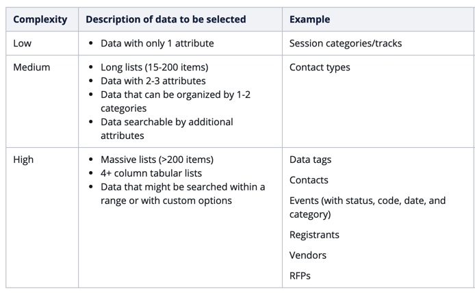
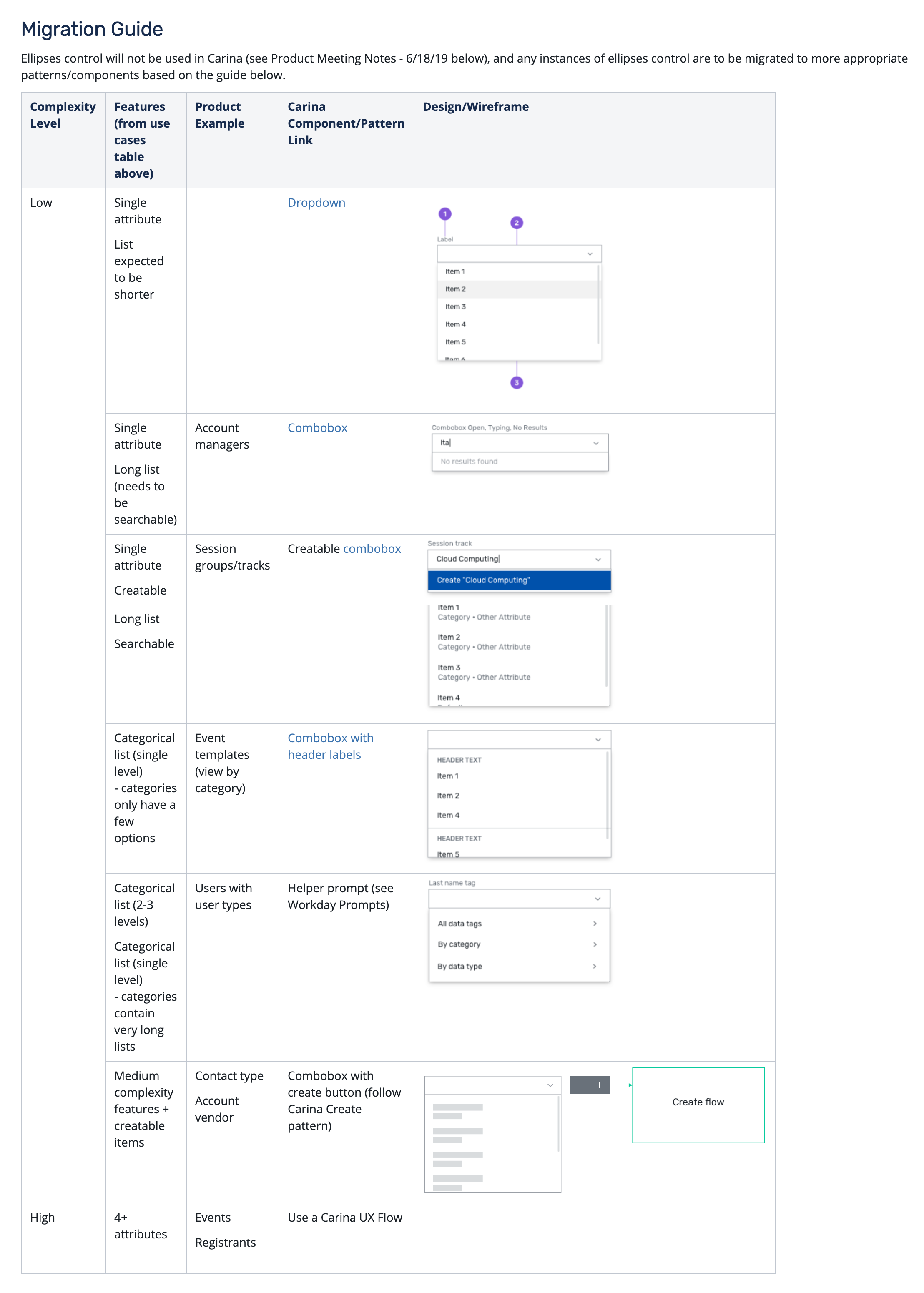
After the design crit, I iterated once again, remaining within the complexity model of low, medium, and high complexity. I also refined the definition of what it meant to be low, medium, or high complexity. I came up with this table:
I proposed a replacement for the modal from the high complexity model — a panel with detailed options instead.
The next design critique had a bigger audience, including Julie, the Director of User Experience.
Stephanie (Design Manager): Can we peel back the experience more and simplify it? Create wouldn't happen in a modal.
Julie (Director of UX): I feel like it's trying to do too much.
Nate (Product Designer): For enterprise suppliers, it would be rare for them to have to create within a form. They would create items elsewhere.
Jacob (Product Designer): This pattern would work well with my Question Library flow (choosing predefined questions for a post-event survey).
Vlad (Visual Designer): Can we do a flyout instead of a panel? We should save panels for Editor experiences.
Based on the comments from the design crit, I moved towards a simpler solution — no more modals or panels. I realized that we were trying too hard to give the user extra flexibility, when in reality, the option to create new items for every form input would probably overwhelm them.
Carina's design principles are about being fresh, simple, and inviting. A complex table hidden in an ambiguous control did not follow those principles. Instead of a one-size-fits-all solution, I came up with a range of solutions for the variety of use cases I found in the Cvent products.
The need for these components came directly from the use cases that were previously (poorly) addressed with the Ellipses Control.
My work on the Ellipses Control Migration Guide provided a framework for designers trying to work with complex flows within Cvent products. Event planning is a highly complex job, and there are thousands of different types of data to create and select from. With my UX Jam and design critique presentations, my work brought together several different designers working on vastly different products, and made them think, "How can we unify our design flows?"
Besides using the same components, colors, and fonts, how can we design a more consistent experience across different products? What patterns can we unify across products?
After I designed the migration guide, the entire UX team felt that we needed to develop the UX patterns for Carina as soon as possible; creating components wasn't enough. Soon after, the Modify, Create, and Delete patterns were designed by the very designers who helped out with the Ellipses Control.
Overall, I think that working on the Ellipses Control with so many talented designers, developers, and managers across different products showed me that it takes a village to build a design system.