As a Carina Design System designer, I was asked to contribute additional components to the design system. I worked directly with developers, an accessibility designer, and the Carina Design Manager. In addition to the design of each component, I was responsible for coming up with different interaction states, accessibility guidelines, and usage guidelines for other designers.
1. Creatable & Detailed Combobox
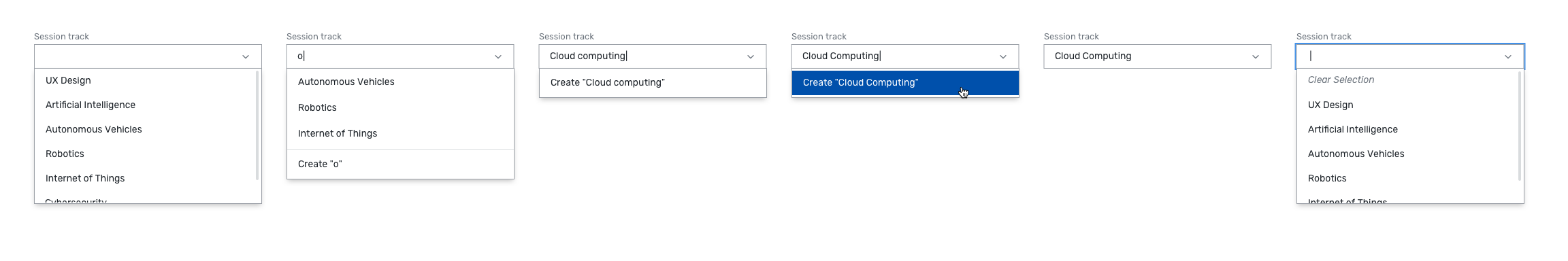
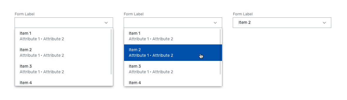
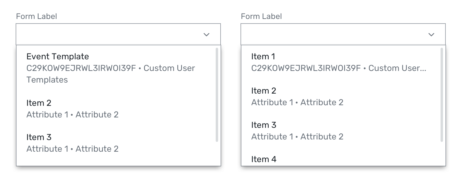
These two components were extensions to the regular combobox component. I discovered the need for these components as part of my Ellipses Control design. The Creatable Combobox allows users to create items that aren't a part of the list. The Detailed Combobox has a secondary line of text with additional attributes to help the user decide which item to select.
2. Text Link
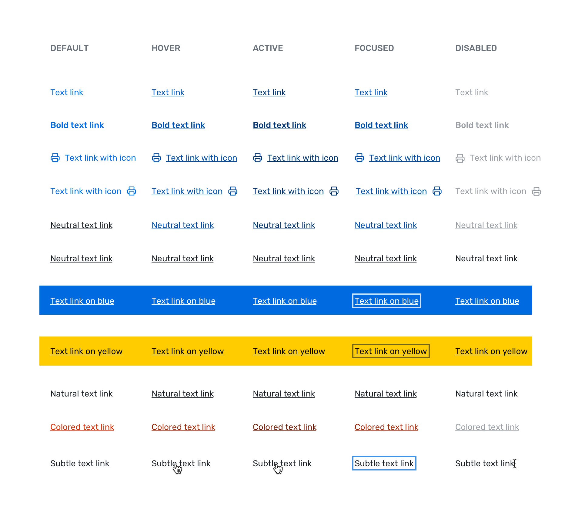
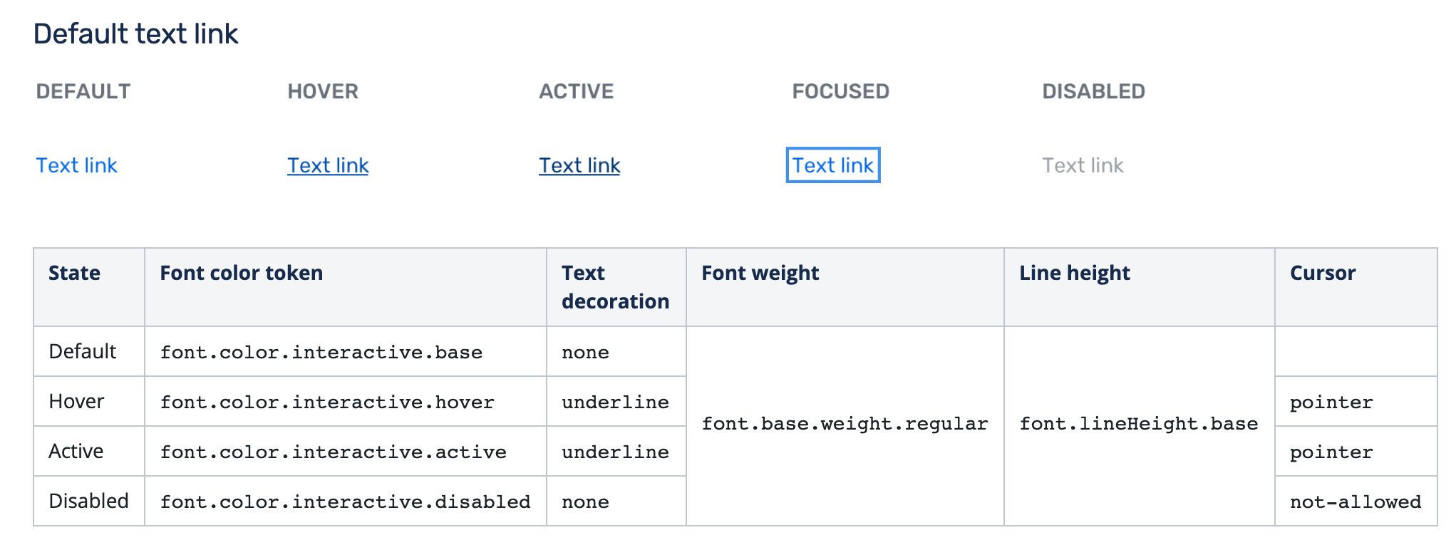
This component seems simple — just a regular hyperlink. However, it had a lot of different states and style variations, so I had to work on researching and designing dozens of different text links.
3. Dueling Picklist
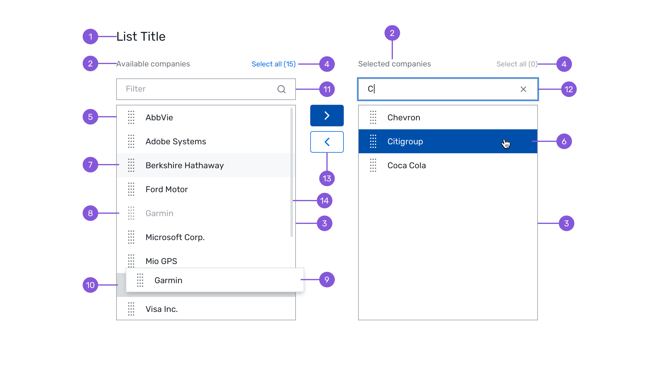
The Dueling Picklist is a component that is used for comparing and selecting items across two lists. It is only used for special circumstances, on desktop sites only. I prototyped this in Framer X since the drag-and-drop states could not be easily portrayed in a static screenshot.
During this time, I got familiar with many different tools and workflows:
The process for each component involved three phases: Discovery, Design, and Documentation.
During the Discovery phase, I looked into how the component was used in Cvent products currently, as well as how it was used at other companies and in UX in general.
When I started designing, I had to keep a lot of factors in mind. I spoke with Josh, an accessibility designer at Cvent, extensively about ensuring my designs were accessible. This went beyond just color contrast. I learned about designing for keyboard interactions and focus states.
Additionally, I checked in with developers every week at sprint meetings and design critiques. Oftentimes, developers would challenge me with edge cases that I hadn't thought of. For example, when I was designing the Detailed Combobox, they asked what would happen if we have really long attribute names.
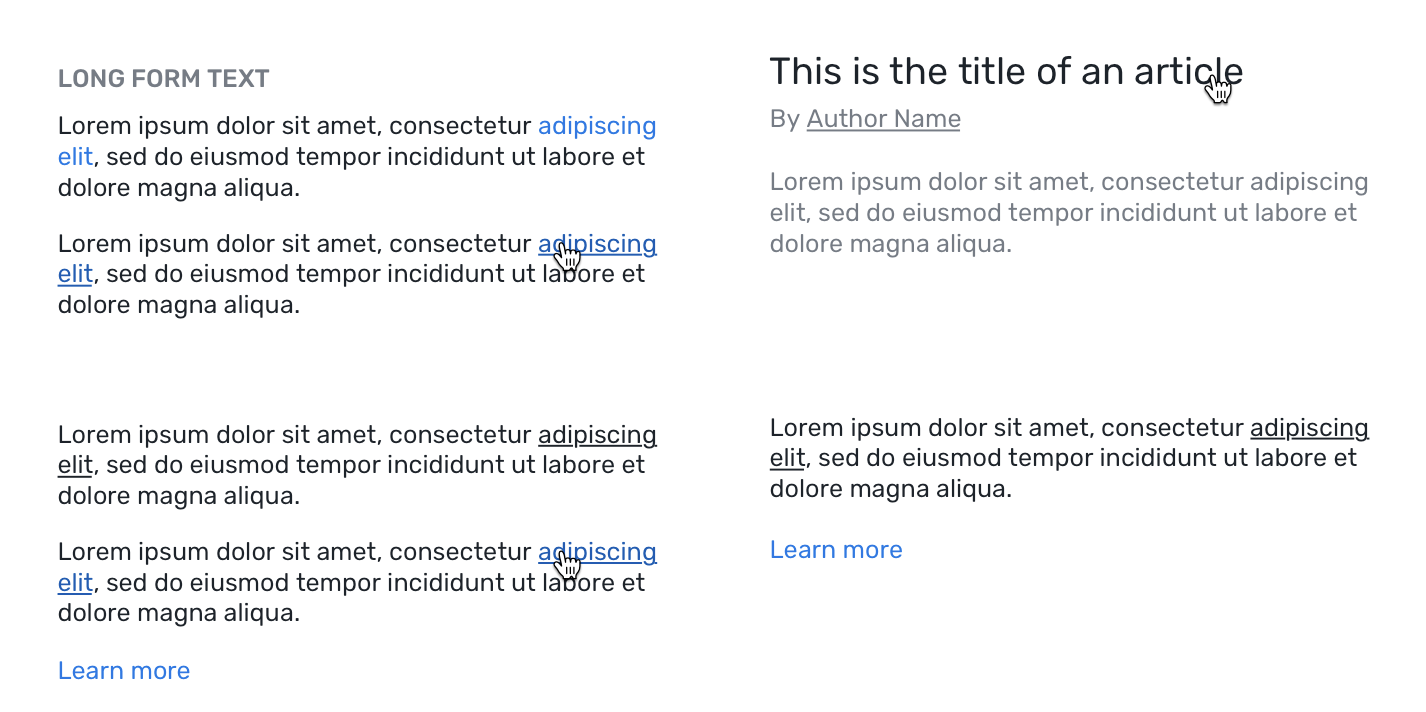
It goes without saying that a design can only be as good as the discovery work. I often found myself going back to do more discovery work, to design for every possible edge case and interaction state. For example, I discovered the need for more text link designs than I had originally planned for, like text links within blog posts.
After I finished all my designs, I had to document them so they could be added to the design system. I took extra care with communicating my intentions clearly. I addressed all the unique behaviors and states of each component, and carefully documented the design tokens and other attributes for each variation.
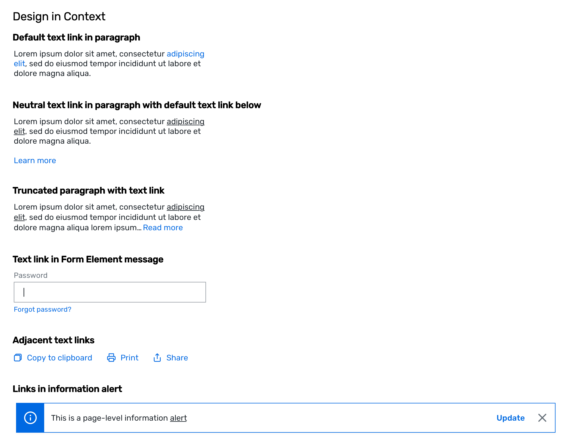
Additionally, as a new designer and a former developer, I was able to bring a fresh perspective when it came to documentation. I made my manager and teammates aware of factors that might be useful to indicate to developers, such as specific tokens to use. I added a new section to the documentation template called "Design In Context," which showed examples of how the component should be used. Sometimes, usage guidelines written in text are not enough, and it's important to show a visual example:
I felt that this level of thorough documentation strengthened our design system, as it made it easier for other designers to use and understand different components without having to ask the design system team.
My perspective as a former developer and a new designer was invaluable to the team. I was able to communicate effectively with the developers, as well as offer insight on how to communicate to designers who aren't as familiar with Cvent products. A good design system is all about communication and thorough documentation.
Additionally, while working on my components, I found that documentation doesn't always have to be written in text.
"If a picture is worth a thousand words, a prototype is worth a thousand meetings." -IDEO
I added the "Design in Context" section to my Text Link documentation to show how to properly use the component, rather than just listing usage guidelines in bullet points. I also prototyped the Dueling Picklist in Framer X, rather than providing twenty different screenshots as other designers had been doing previously. I expressed the need for more prototyping incorporated into the workflow with the Carina Design Manager, and she agreed.