
Designing a stock analysis app that does the work for investors
InvestorsObserver is a large stock market analysis and media platform. They provide news and data-driven analysis on stocks and options, and have over 2 million monthly users. I was hired via ISS to help InvestorsObserver design and launch their platform onto a mobile app.
Design: September - October 2020 (7 weeks)
iOS Development: January - June 2021 (6 months)
Android Development: August - Present
InvestorsObserver offers stock analysis for people who may not be experts in investing. Their goal is to do the work for investors using their stock analysis algorithms, so even beginner investors can determine which stocks, sectors, and industries to invest in.
The previous platform was on web only, so through my user research, I sought to determine the needs and goals of mobile users specifically:
Throughout the design process, I dedicated a lot of time towards breaking down each feature and rethinking it for a mobile context. Something that became very important to my design work was keeping a balance between optimizing for mobile and maintaining a consistent cross-platform experience.
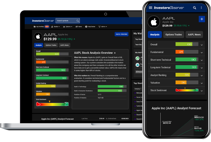
As a content-heavy platform, it was a huge challenge to scale everything down onto a mobile screen. The final design incorporates a strong visual hierarchy and carefully thought-out visuals that enable the user to understand content and analyze stocks easily, even on a small device.
.gif)
.gif)
.gif)
.gif)
.gif)
.gif)
.gif)
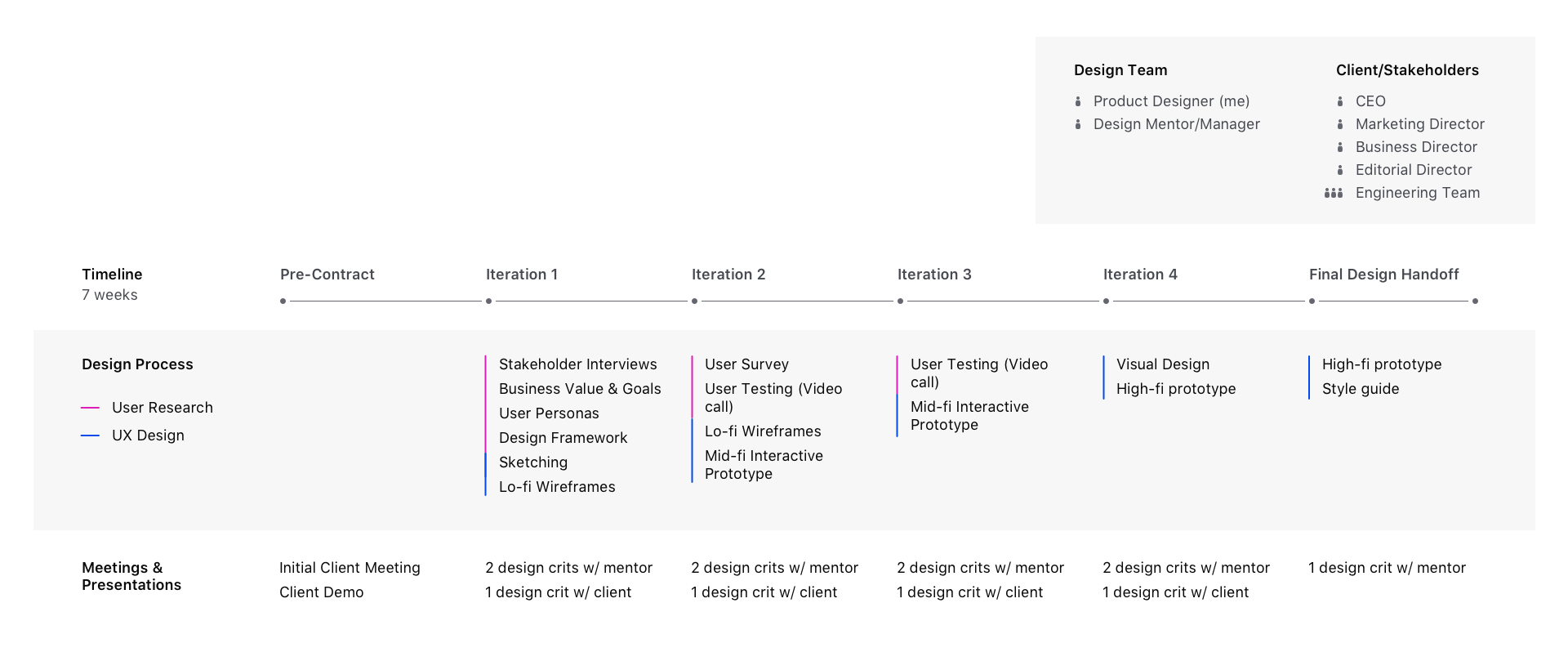
We began by meeting with the client and having them introduce us to the challenge. The client stated that there was a lot of demand for an iOS app for their stock analysis platform. They had a mobile site, but it wasn't a mobile-first design. They stated that most of their conversions happen on desktop, so they needed to target their mobile users more.
I started my research by meeting with the client and going through the product on my own. Then, I started defining the business value and goals of the mobile app design and how they relate to the overall business goals.
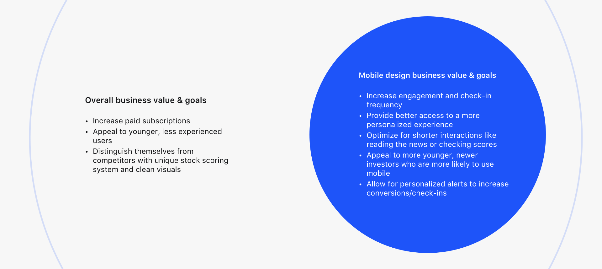
After several meetings with the client's Marketing Director and Editorial Director, and researching more about investors, I came up with a few key points:
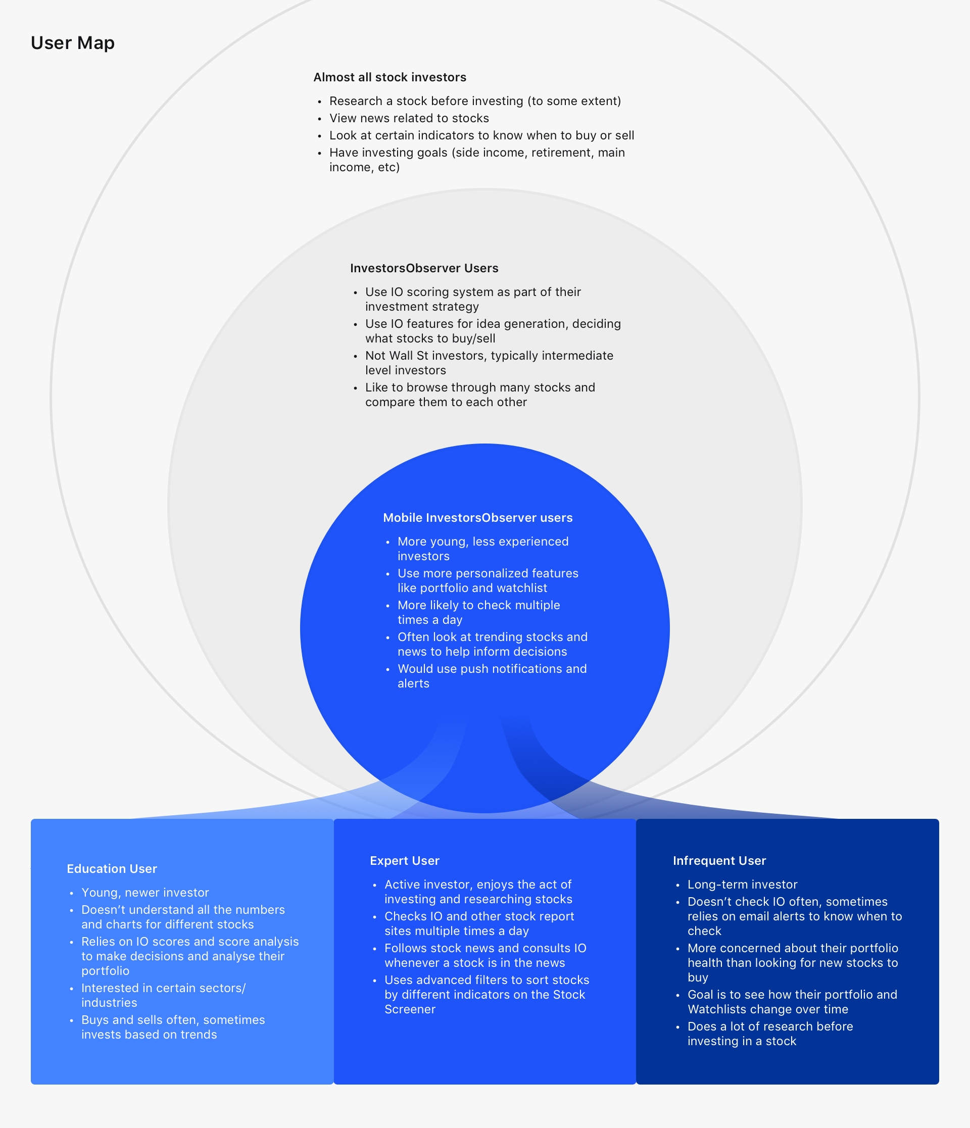
I mapped out where the users of this app would fall in the context of the entire market. After mapping this out, I developed three personas within this subgroup, classifying all the different behaviors I learned about.
After defining the problem space, my mentor and I worked together to define a design framework for the project. This combined some challenges that we foresaw, as well as the goals of the design problem.
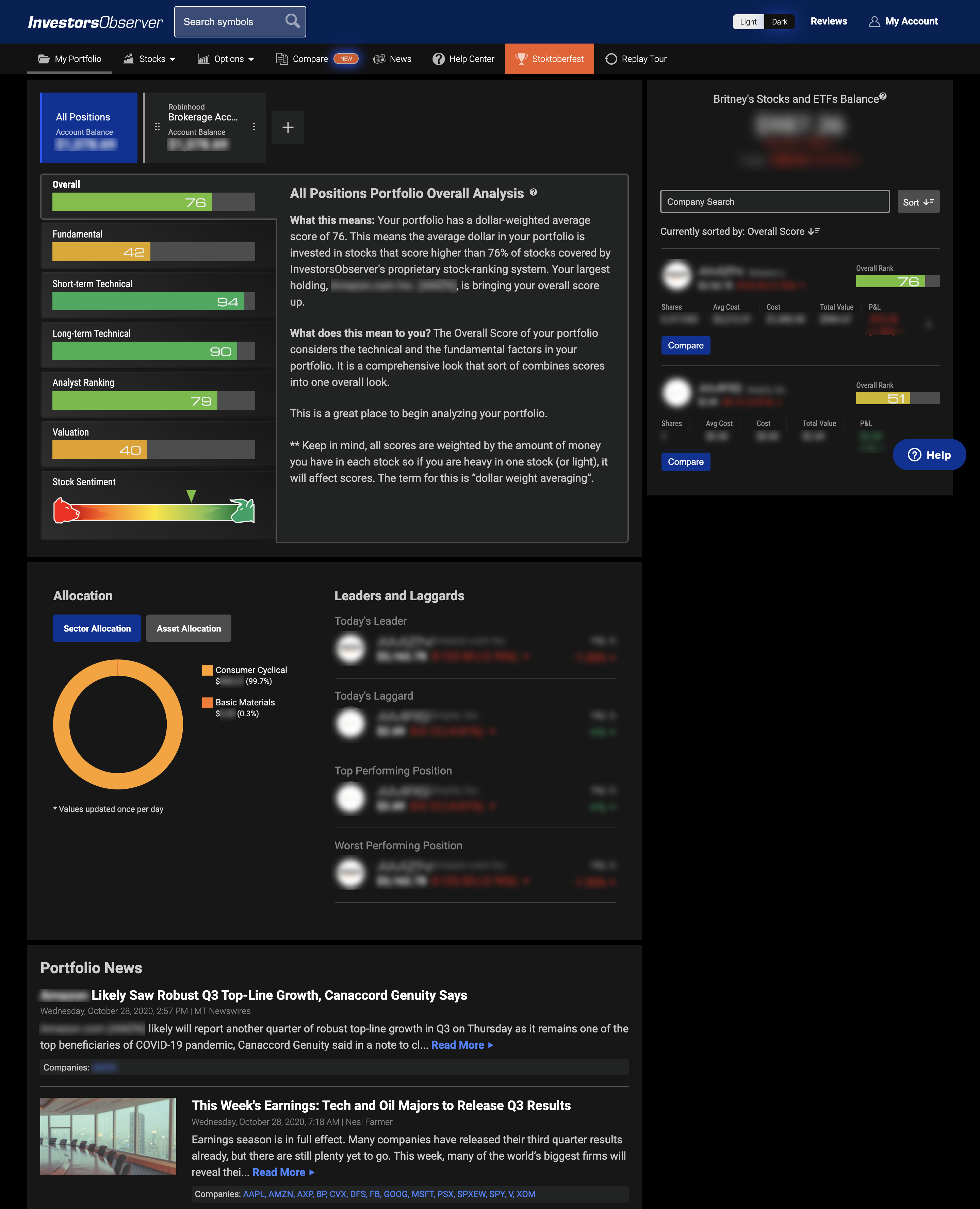
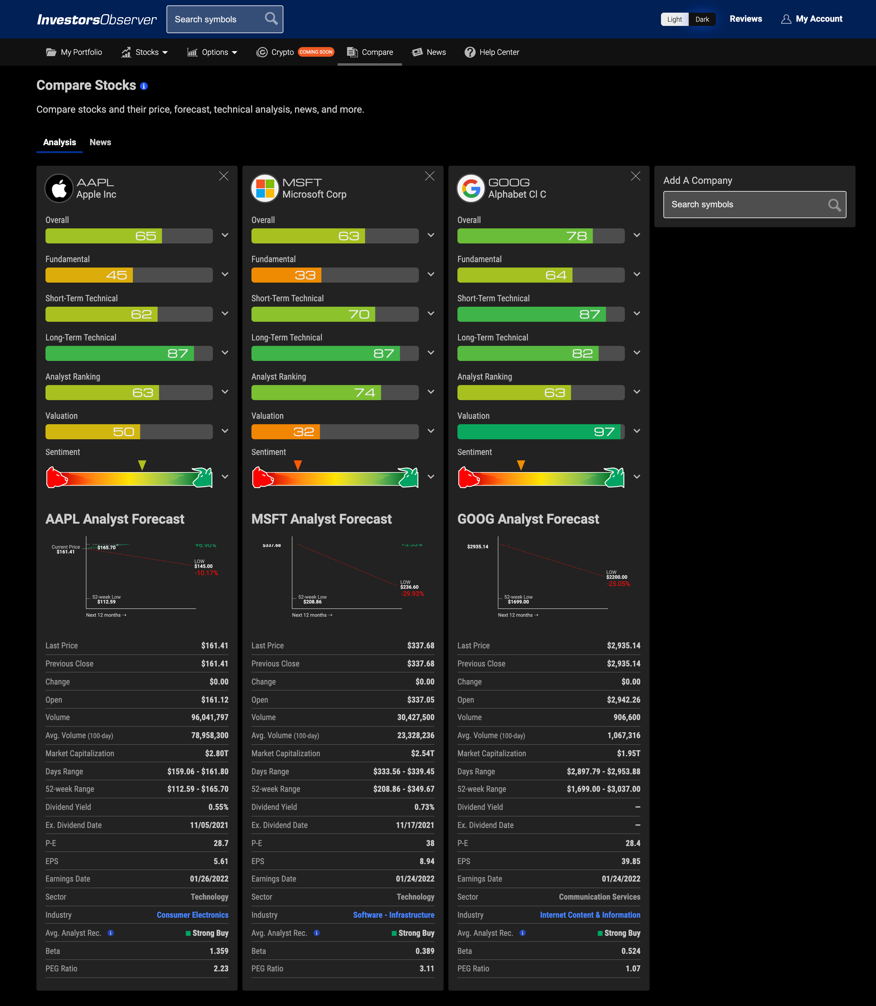
The core of InvestorsObserver’s product is comparison. Designs should allow users to easily make comparisons across stocks, sectors, lists, industries, and more.
Why? Successful comparison tools can result in informed decision-making and idea generation without extra cognitive load on the user.

Provide clear context for InvestorsObserver’s unique analysis.
Why? Context empowers newer, beginner investors to learn how to navigate the stock market.

Coherence ensures a seamless product experience. Investors should be able to move from feature to feature without being confused about the interface.
Why? This allows for users to focus solely on the data and information that IO provides.
After completing my discovery and research, as well as planning the navigation of the app, I began working on the design. Below is an example of one feature that evolved through this iterative design process.
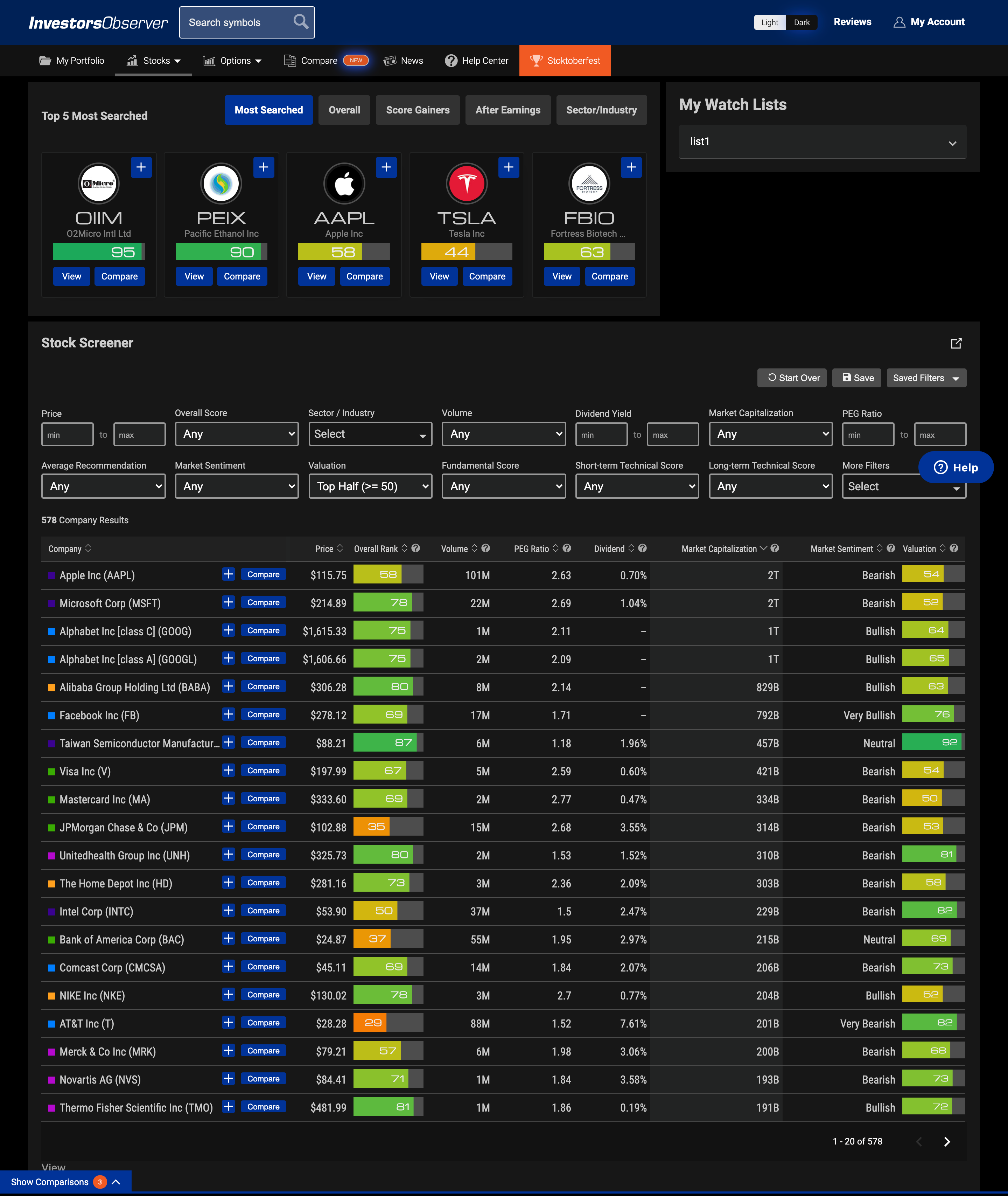
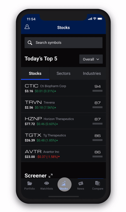
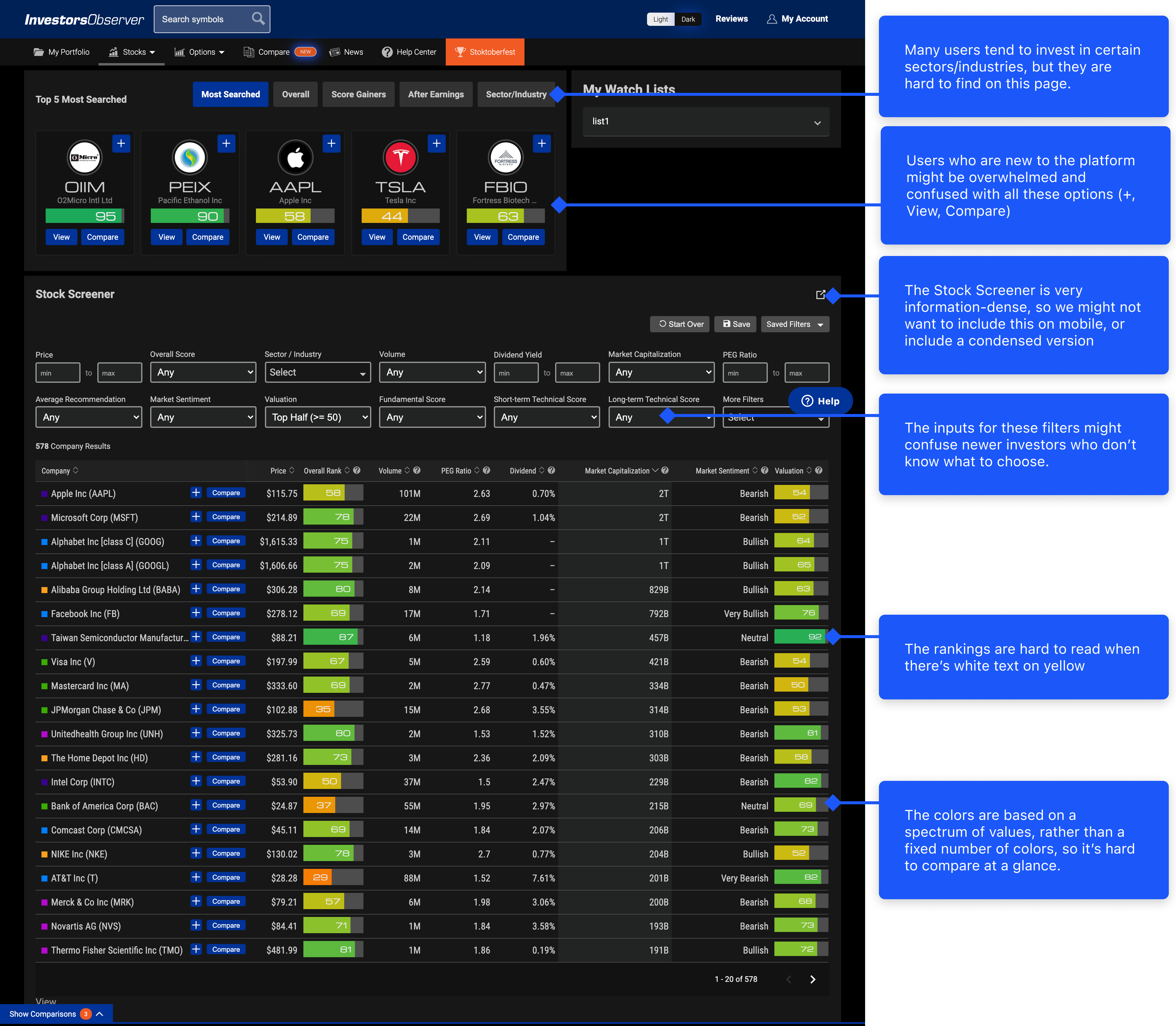
One of the most vital screens in the app is the Stocks page. The client explained that the Stocks page is "where users discover stocks to buy." We started each design process by analyzing the design of the screen and determining what works and what doesn't, from the perspectives of our personas.
The first iteration, which we presented to the client, was all about layout, and trying as many ideas as possible, no matter how bad they were. These layouts varied in how the Top Stocks, Sectors, and Industries were laid out, as well as how the sorting within these groups was laid out.
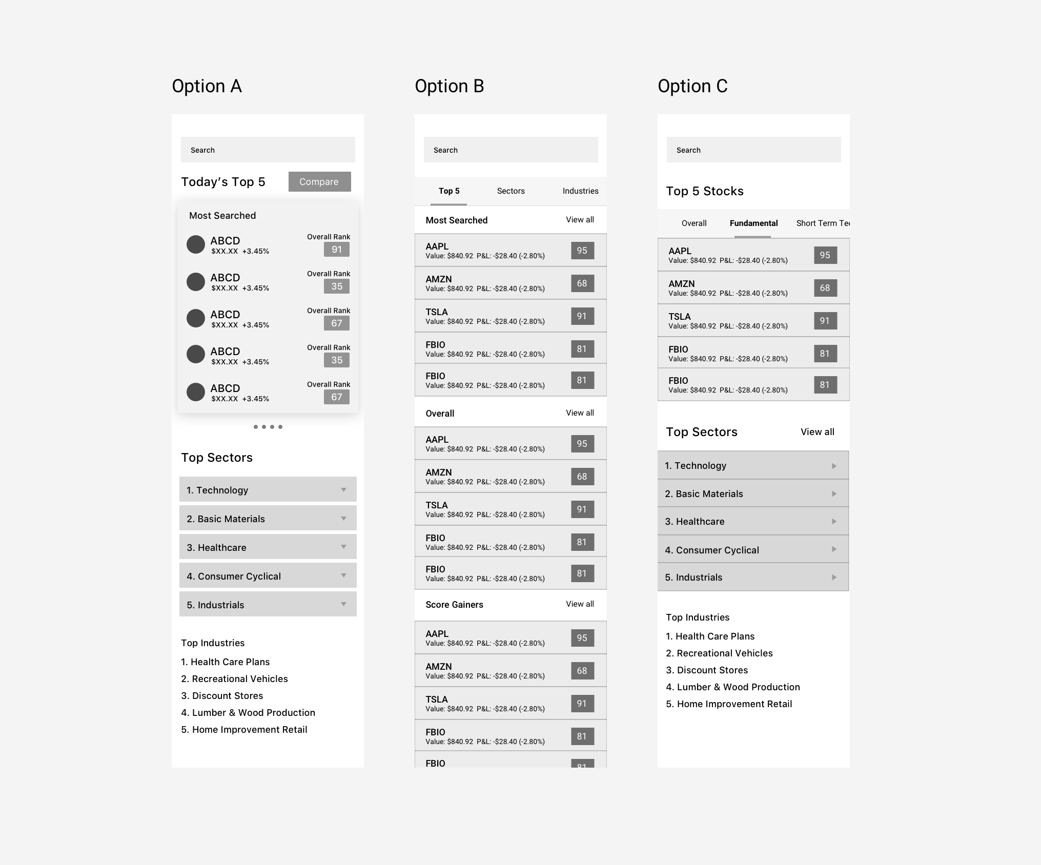
Additionally, discussing the Stocks page sparked a conversation about what users actually want to see in terms of Top 5 Stocks. I decided to incorporate this discussion into user testing, so we can get a better idea of what users use to decide which stocks are worth learning more about.
.gif)
Based on the importance of sectors and industries to users' investing routines, I split the screen by Stocks, Sectors, and Industries.
Feedback from the users and client:
"I use the top 5 a lot, I usually look at the Short-Term Technical score." -IO User
"I mostly invest in biotechnology and technology stocks, so the Sectors and Industries are useful to me." -IO User
All users from user testing stated that they use the stock screener to filter out particular stocks, which is missing from this page.
"Can we keep the look of the sectors and industries consistent with the Top 5 Stocks?" -Client
.gif)
This screen saw the most changes after user testing. All the users stated that they used the Stock Screener as part of their investing routine, so I knew it was important to try and include the Stock Screener on this page.
In order to maintain coherency, as outlined in the Design Framework, I moved the Sectors and Industries to the top, mirroring the layout of the website.
The filtering interaction was inspired by filtering out items on an e-commerce site. The whole app has a lot of parallels to e-commerce, since users are basically "shopping" for stocks to invest in.
One thing that I kept in mind during the visual design phase was the comparison part of our Design Framework. This screen had a lot of information, and visuals played a huge role in allowing users to distinguish between different data points in order to compare stocks.
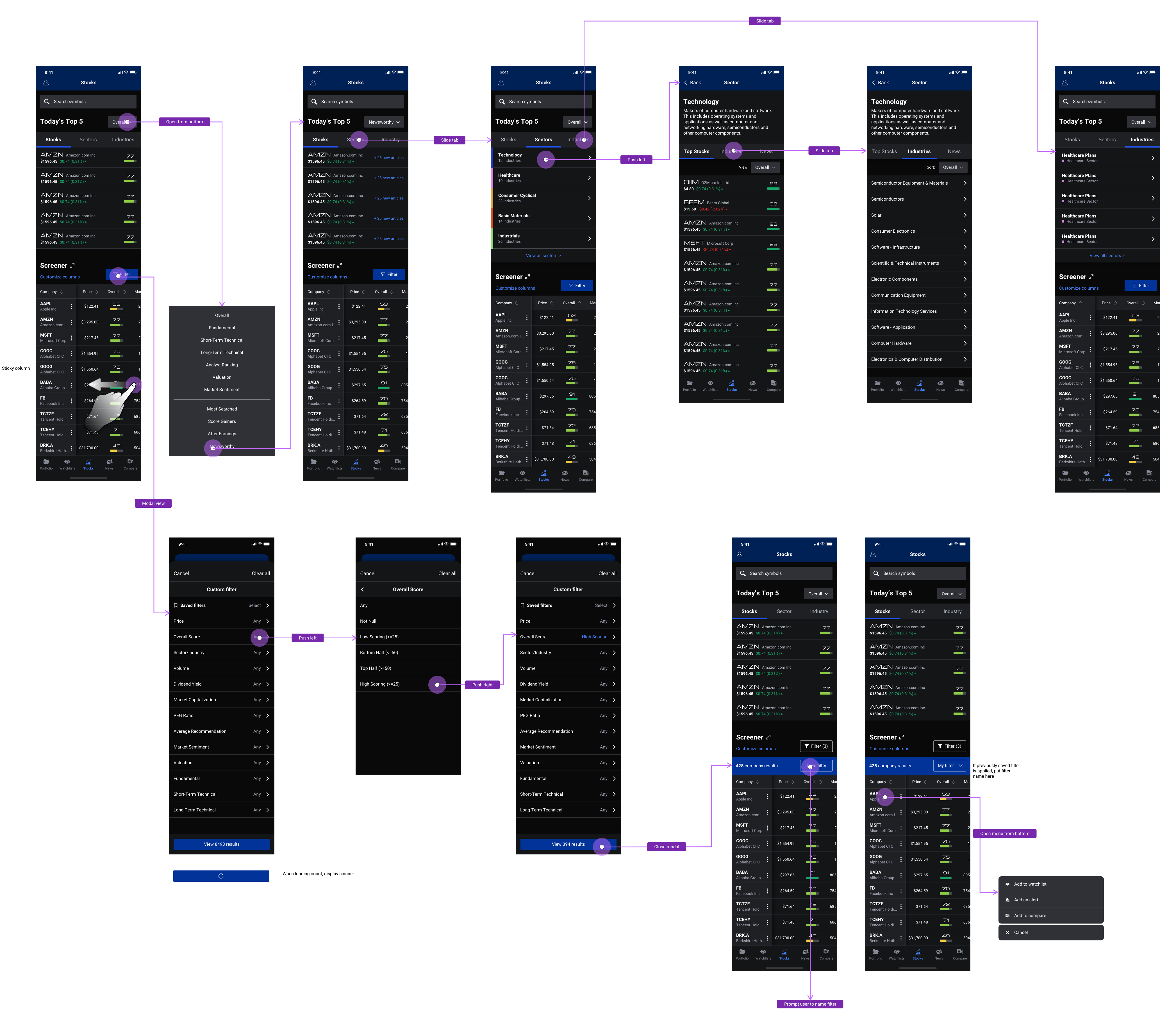
Once the visual design was completed, I prototyped it in Framer to show how the Screener table would scroll.
We heavily involved the client and other stakeholders at all steps of the process, resulting in a final product that the client was very happy with. Furthermore, there were several instances where we were designing for the mobile app and helped the client realize some improvements they could make to their site. We helped them see their product from a user-centered perspective. After asking for feedback from the team, they said that my UX expertise saved them months of deciding on a design.
A few months after I handed off my final designs, I was invited to join the development team as a front-end developer. I'm currently leading the development of the front-end, designing every interface using Swift and Xcode. Using my design expertise, I organized the styles of the app and contributed to the overall app architecture and navigation. I also helped fill in the gaps for unexpected app behavior, like empty states and loading screens.
Overall, I had a great time working on this app. It was the biggest design project I'd ever worked on, and could quite possibly have the most impact. At first, I was scared to take on such a big role, as I was leading the research, design, and testing. Therefore, I didn't take the lead on research in the beginning, waiting until later in the project to start talking to users. However, by the time I started user testing, I grew more confidence in my decisions and my ability to lead. Here are some of the biggest lessons I learned:
Although I have a background in development, I had never developed something I designed for production before. I learned a lot about how to be a better designer through working on the front-end development. I had left a few things missing in the design that I discovered during development, like empty states or loading screens. As a developer who had worked on the design, I was able to fill in the gaps easily.